Week 17
Monday 12th February [written weds 14th feb]In the morning, I checked my email & Moodle to recieve the assignment brief. I used the weekly session guide on Moodle to get a better handle on the project and what we would actually be doing tomorrow, which I appreciated, as it helps with the stress I experience when getting a new brief. At first I was nervous about doing 3D work, but the packaging design brief was inspiring, since I've been wanting to work on more editorial or publishing type illustration recently (I'm hopefully applying for some publishing internships this summer.)
I then went to the British Library's Fantasy exhibition, not specifically for this project, I just wanted to see it, but I suspect it'll inspire me later down the line. I liked the presentation of the exhibition, with the vaulted archways that split up rooms and the translucent wall dividers, creating an otherworldly, but it was cramped in places, especially since there were a lot of people inside. As for the work exhibited, it was largely Western fantasy centric, but I enjoyed the range it covered and thought it represented the many sides of fantasy well — covering everything from Ghibli movies to Gormenghast. There was a nice mix of works I was very familiar with (it even included the book I was carrying in my bag at the time!) and works I didn't know, and I liked the inclusion of films, video games, and even costumes. I especially liked seeing sketchbooks, manuscripts and notebooks, I love seeing people's sketchbooks and processes in general, but seeing some of my favourite author's (Ursula K Le Guin's) sketchbooks was very cool.
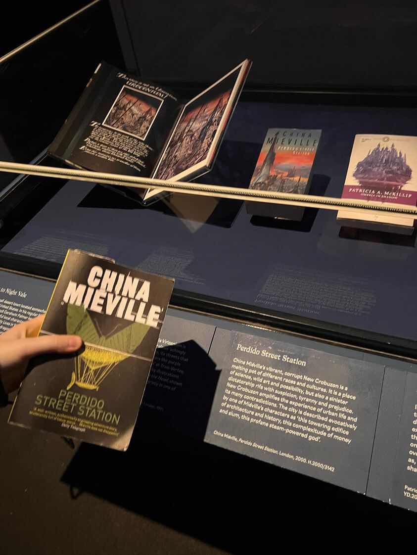
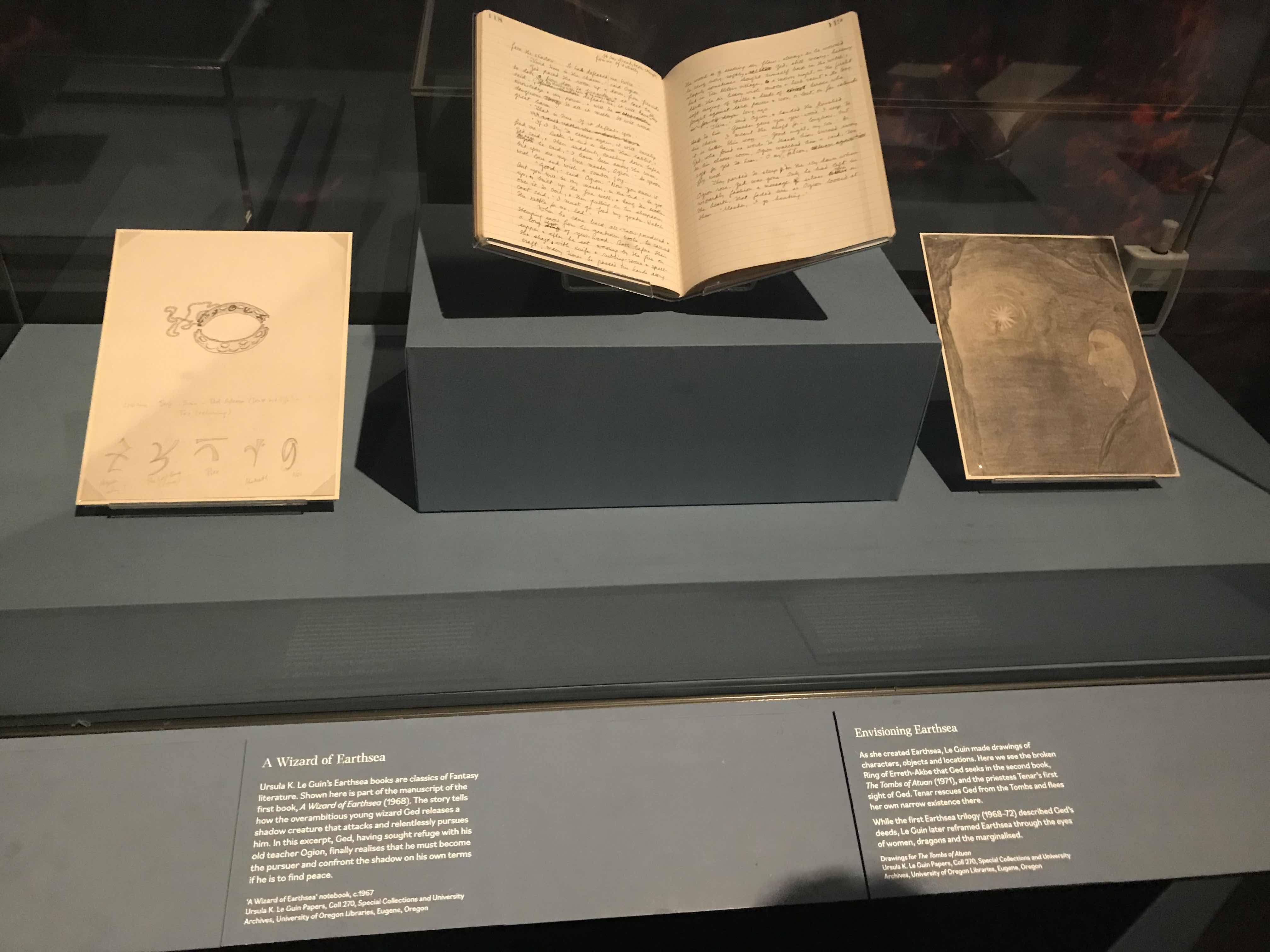
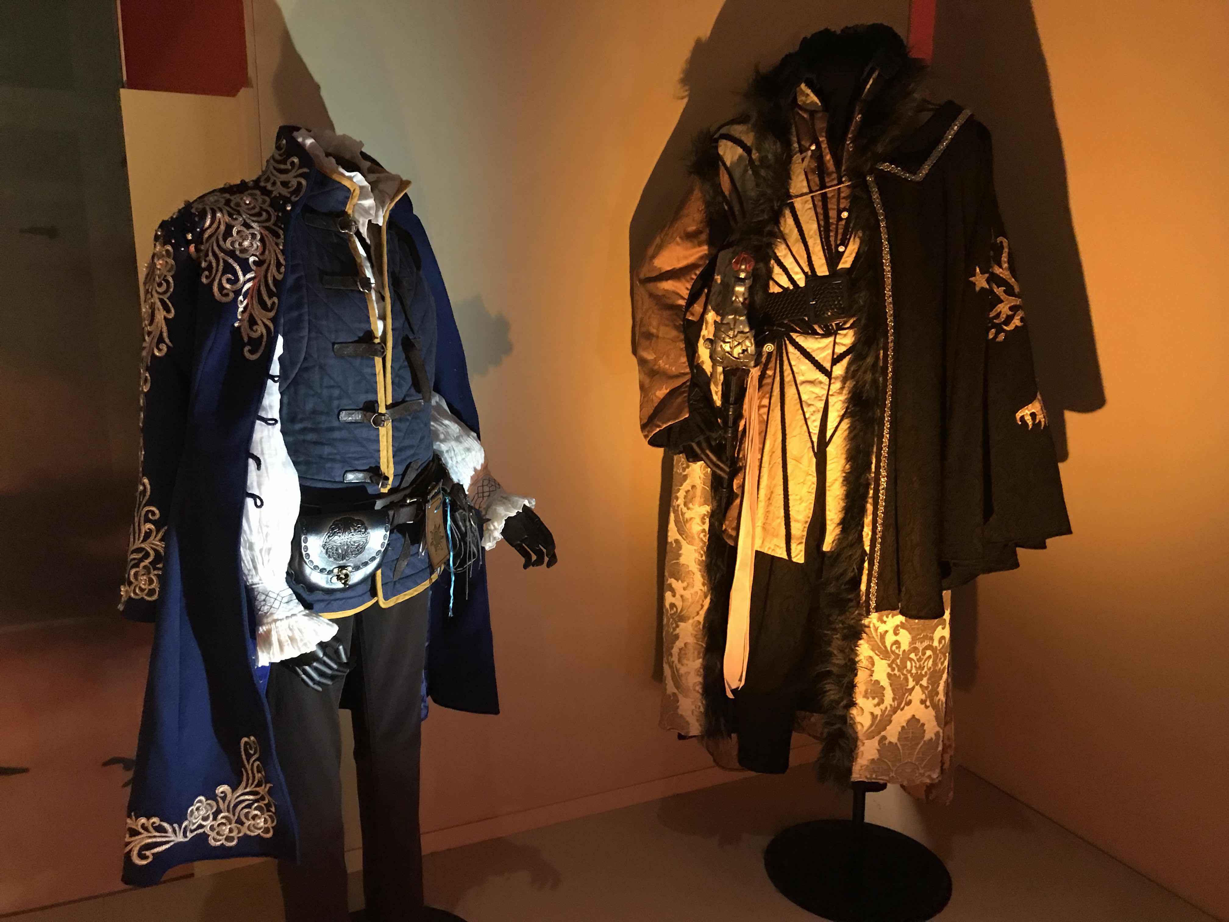

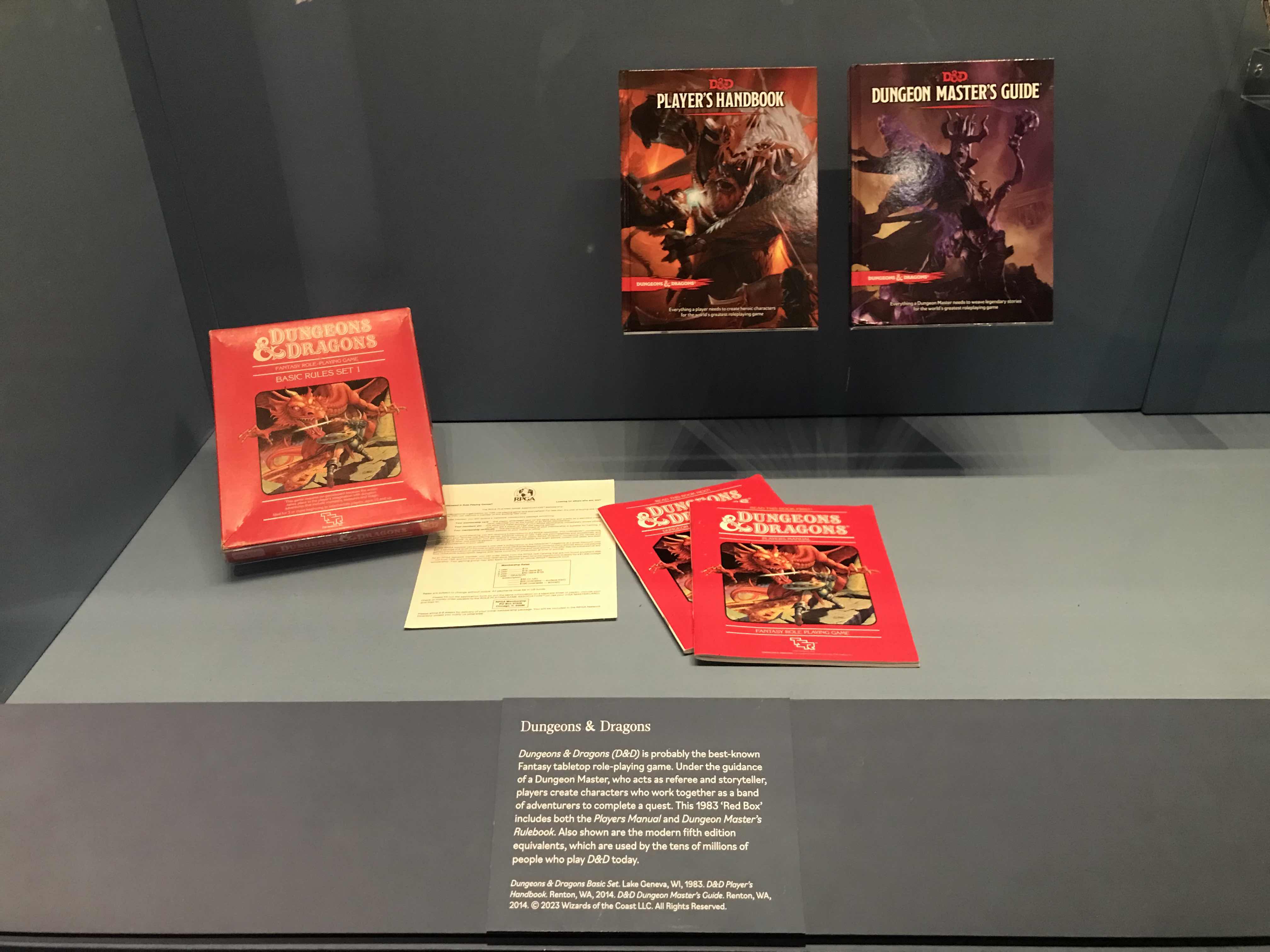
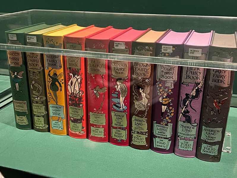
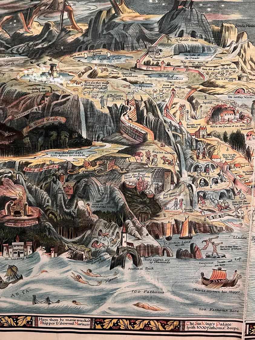
As for the art on display, I was really captivated by Bernard Sleigh's Map of Fairyland: when I think about fantasy, I often think about maps, since a lot of the fantasy books I loved as a kid and still love contain maps, and the detail and colour and border of this map is so beautiful and characterful.

 Tuesday 13th February [written thurs 15th feb]
After the introductory session, I'm feeling rather excited for this brief. I'm nervous about balancing my workload, especially with CTS also running, but I think i could get a lot out of this project. For the theme of my packaging, I thought about doing something more conceptual, but I decided I want to do some straight-up editorial/publishing illustration right now.
Inspired by the British Library fantasy exhibition, I wanted to do something based around fantasy. I thought about my interests and skills, and what I like about fantasy - I really like sharing my interests and I really like getting people into new books. I'm worried it's kind of repetitive for stuff I've already done, since I've focused on fantasy a lot before... but I do enjoy it, so, I think I'll keep going with the idea for now. I decided to focus on people who are interested in fantasy but maybe not regular readers, as opposed to catering to the fandom angle.
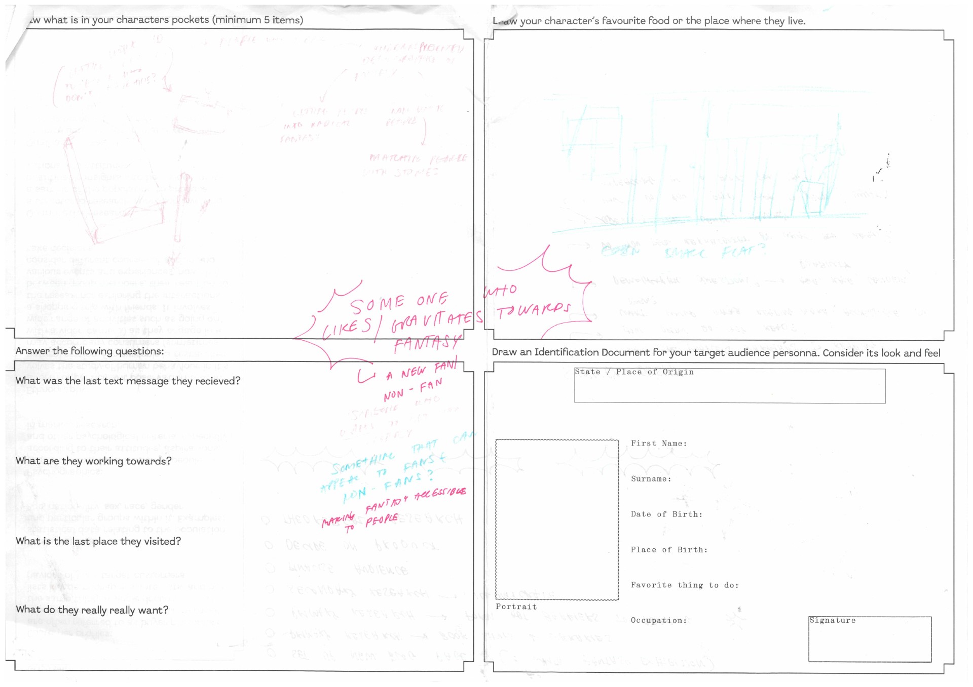
`I decided to focus on making fantasy accessible for people who want to read it but don't at the current moment. I struggled a bit with the audience persona task, as I didn't want to narrow my options down immediatly and I was struggling with coming up ideas of what people who don't read fantasy (or don't read that much) might want, because it's a wide range of people, and I didn't want to be super specific so I could target multiple people. I decided then, that I should do primary research to be able to more accurately identify and cater to my target audience.
My initial idea is to theme my project around maps - when I was a kid, a book with a map in the front was a sign that it would be really good, and I want to share that joy and excitement about fantasy with other people.

 Wednesday 14th February [written thurs 15th feb]
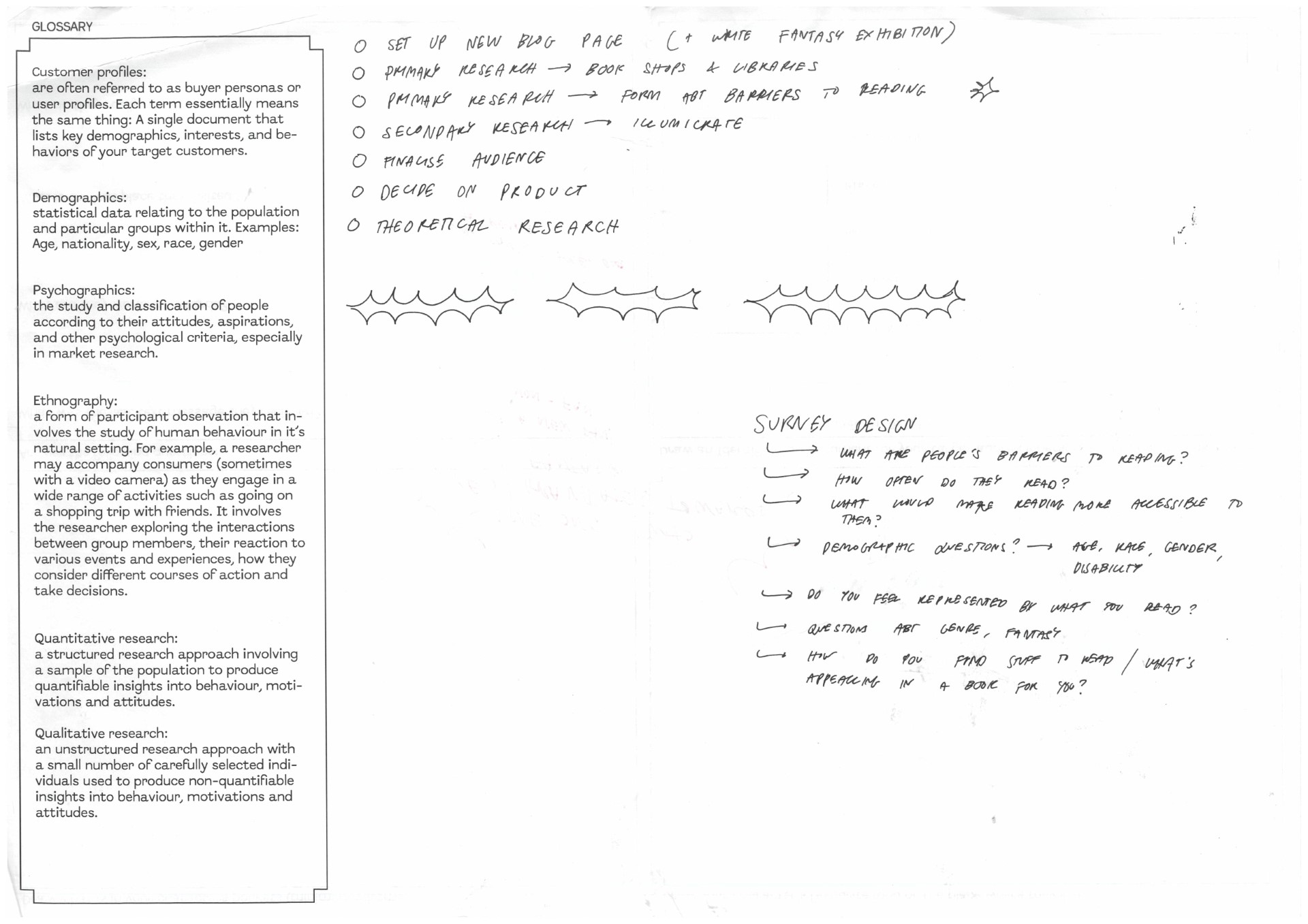
In order to gather information about my target audience, I created a survey on Google Forms. You can view it here. It contains demographic information questions (so I can see what groups struggle with what) & then questions about reading habits, what barriers people experience to reading, and what attracts people to books. I showed it to my CTS tutor for feedback, and then made small posters for it, and put them up around UAL, to get more responses from a wider range of people.
I then set up this blog page!
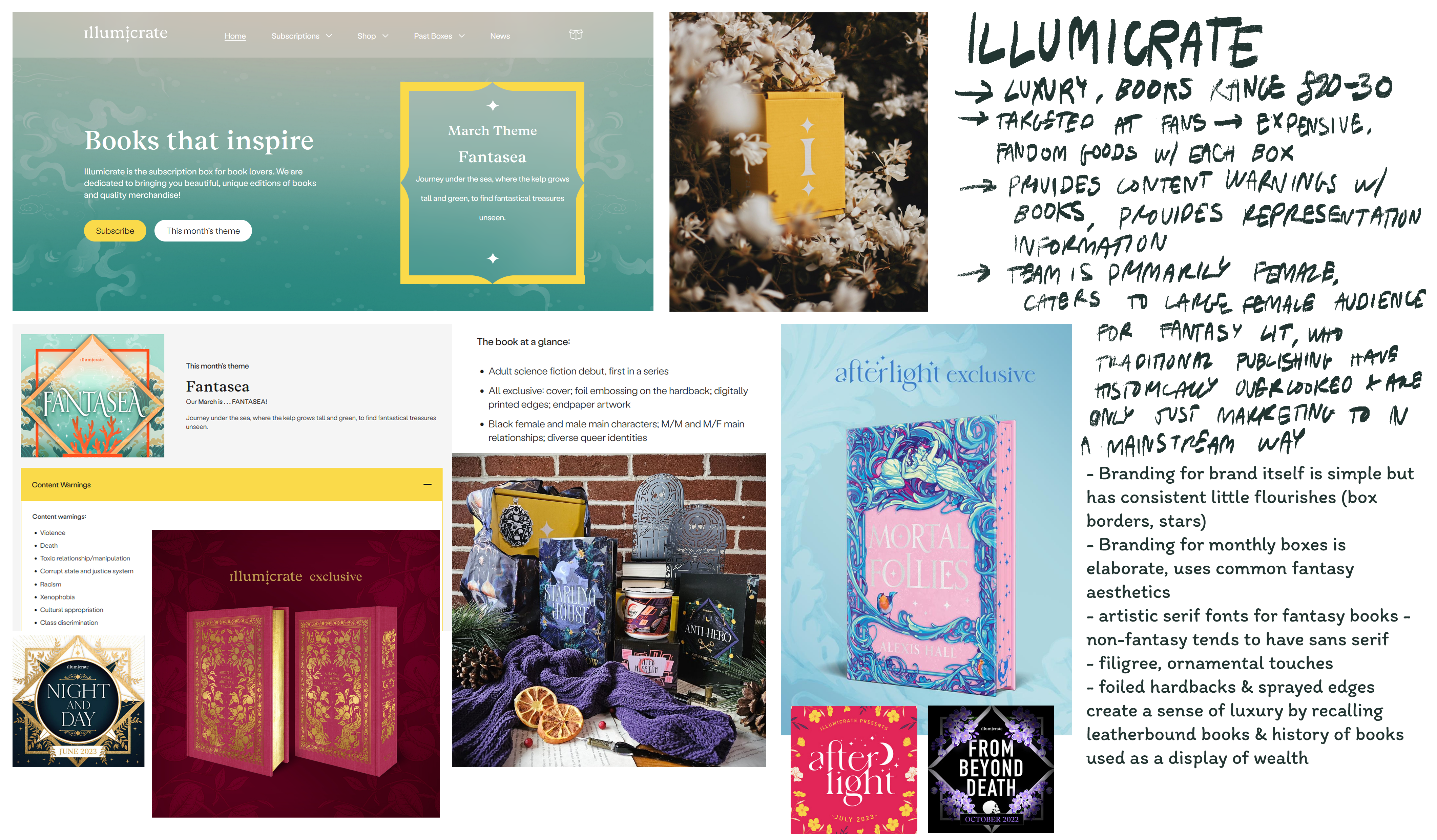
Thursday 15th Feb [written thurs 15th feb]One of my ideas is to create some kind of subscription service or other book packaging that can make literature accessible for people. I decided to research other book subscription services to get an idea of how they market themselves and create unified editions.
The first service I looked at was Illumicrate, a book subscription survery for fans of fantasy/sci-fi that offers luxury editions of both new and upcoming books, as well as novelty items for fans. I took notes on their model and the design tactics they use.
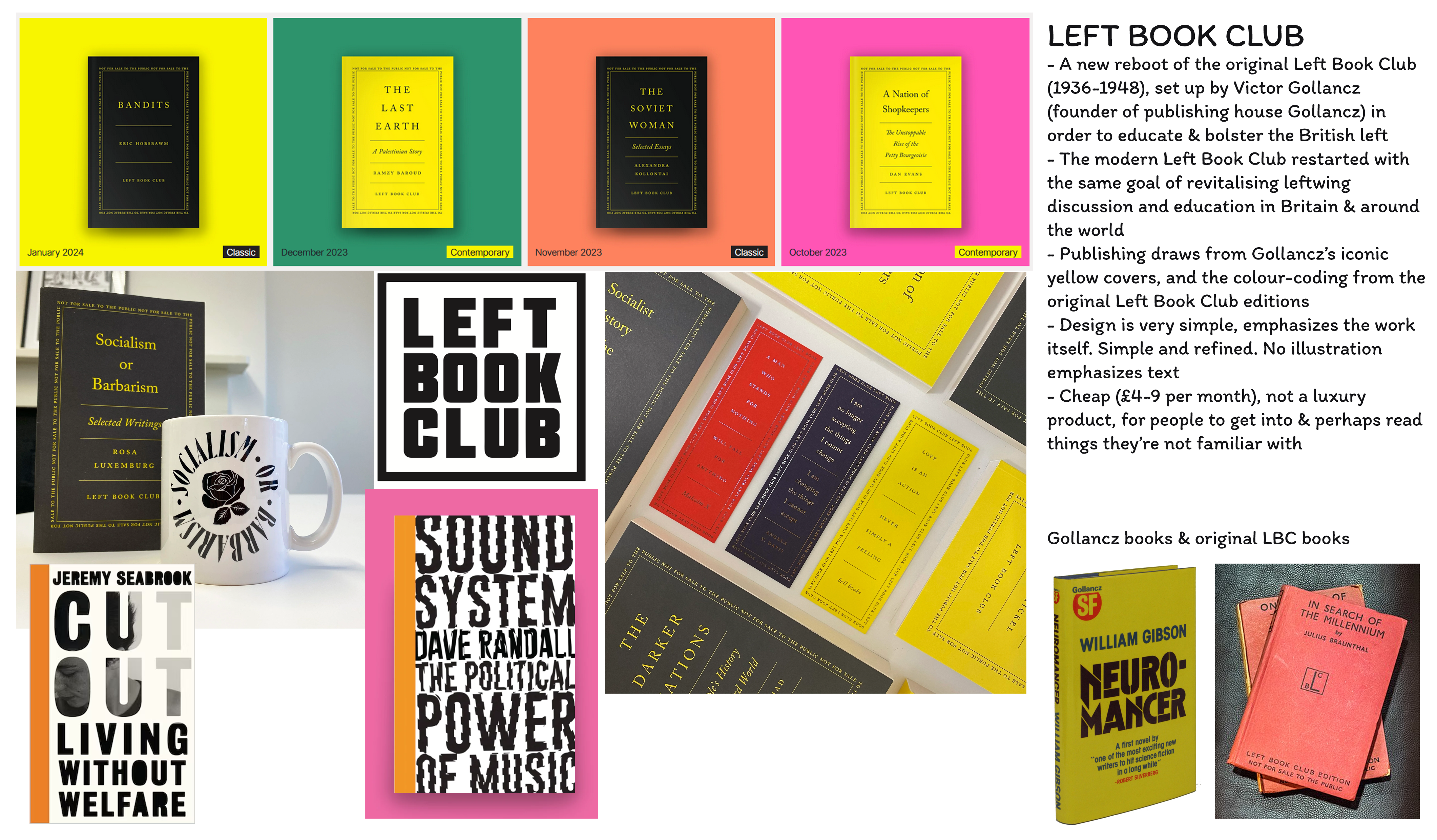
I then looked at Left Book Club, a very different approach that focuses on introducing people to new ideas, and has a much more minimal and information-first approach. I wasn't able to find as much about their model and how they advertise which books they sell on their website (it's gated behind joining), but they have a rich history.
Other things I encountered in my research was Verso Books's book club, which allows people access to every book they release in their library of radical literature. A couple of survery responses have mentioned audiobooks or narrative podcasts as alternatives for print books that can be more accessible for people who struggle with reading due to time constraints or disability.
I also found Abolitionist Future's reading groups and their guide to setting up reading groups as a good resource for structuring reading groups/book clubs and identifying what works to include.
Friday 16th Feb [written weds 21st feb]On our session in Friday, I looked over the responses I'd had to my survey. I mostly got responses from other students, which was good in terms of gathering information, but I wanted to get responses from a wider range of people. However, it's still informing my project well. Key points I picked up on:
- One of the number one reasons why people didn't read books was a lack of time in the day
- Lots of people liked detailed and enticing cover designs
- A lot of people use audiobooks as an accessibility method for reading
- People also wanted a dedicated time in the day to read.
- Whether representation of marginalised cultures or overlooked viewpoints matters to people was exactly 50/50! I don't know what exactly I can derive from this, but it's really interesting.
- Multiple people mentioned preferring illustrations to photographs on a cover, and more people mentioned liking blurbs on the back of a book than liking reviews.
I think there's a lot here I can derive to work on my project. Making sure I put a focus on evocative illustration, and providing accessibility tools like audiobook or phone versions, as well as useful summaries.
I saw this book-like object in the assortment of 3D workshop samples, and thought it might be fun to try and do something similar for my packaging.
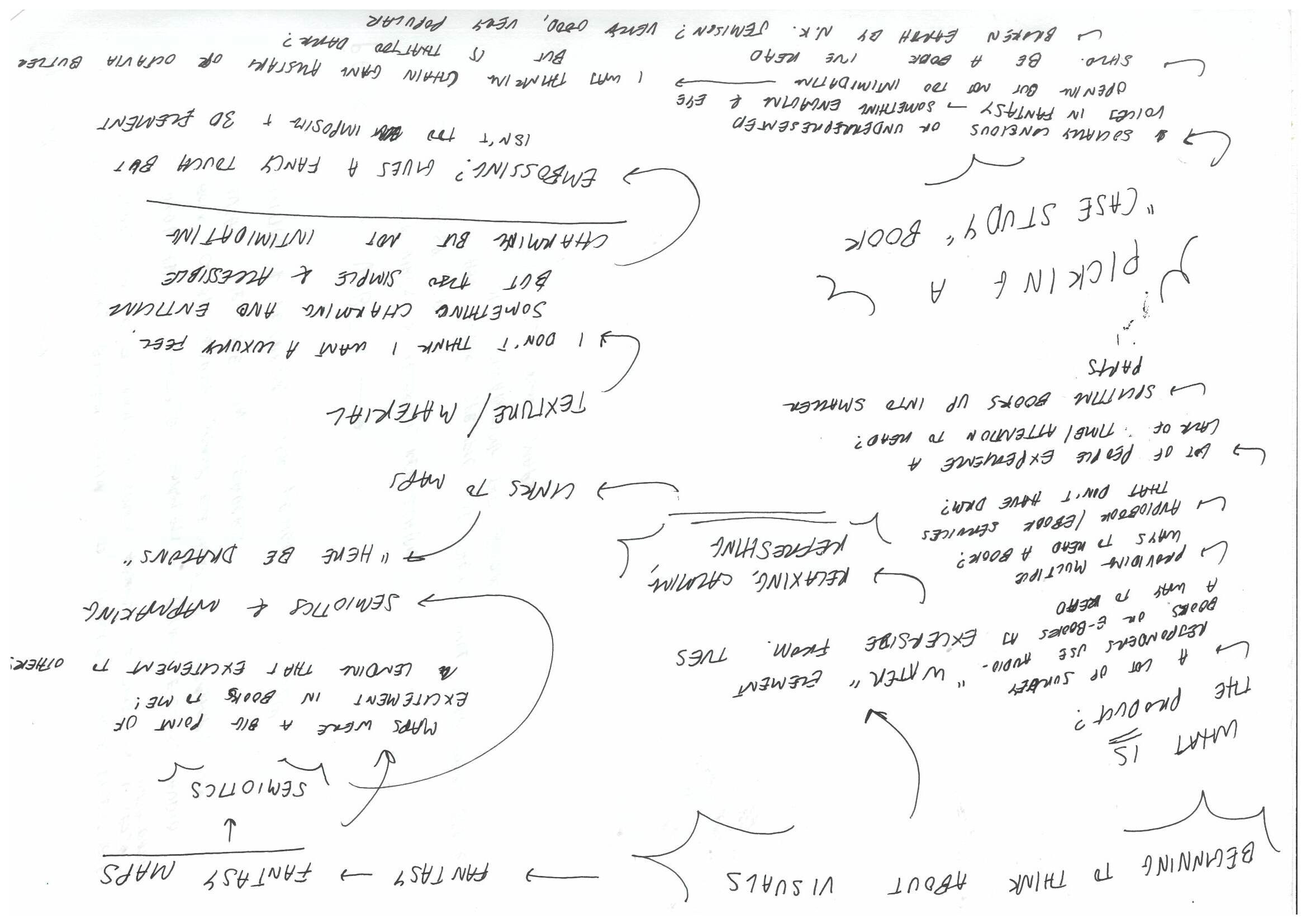
I then had my tutorial with Carlos, as Eleni was working on something else. I found the tutorial useful, and got some good feedback from Carlos & classmates. One of his suggestions was picking a book to use as a case study for this project, so that I can show off tailoring the design to a specific book. He also suggested I start thinking about scale and size, and what I want this product to look like in people's hands. One of my goals is to make it seem as unintimidating as possible, so I would probably go for something compact.
Carlos and also Eleni (when I was able to talk to them) were interested in how I was thinking about accessibility in books, and Eleni said that thinking about accessibility in this way will be incredibly helpful for when I want to apply to publishing internships.
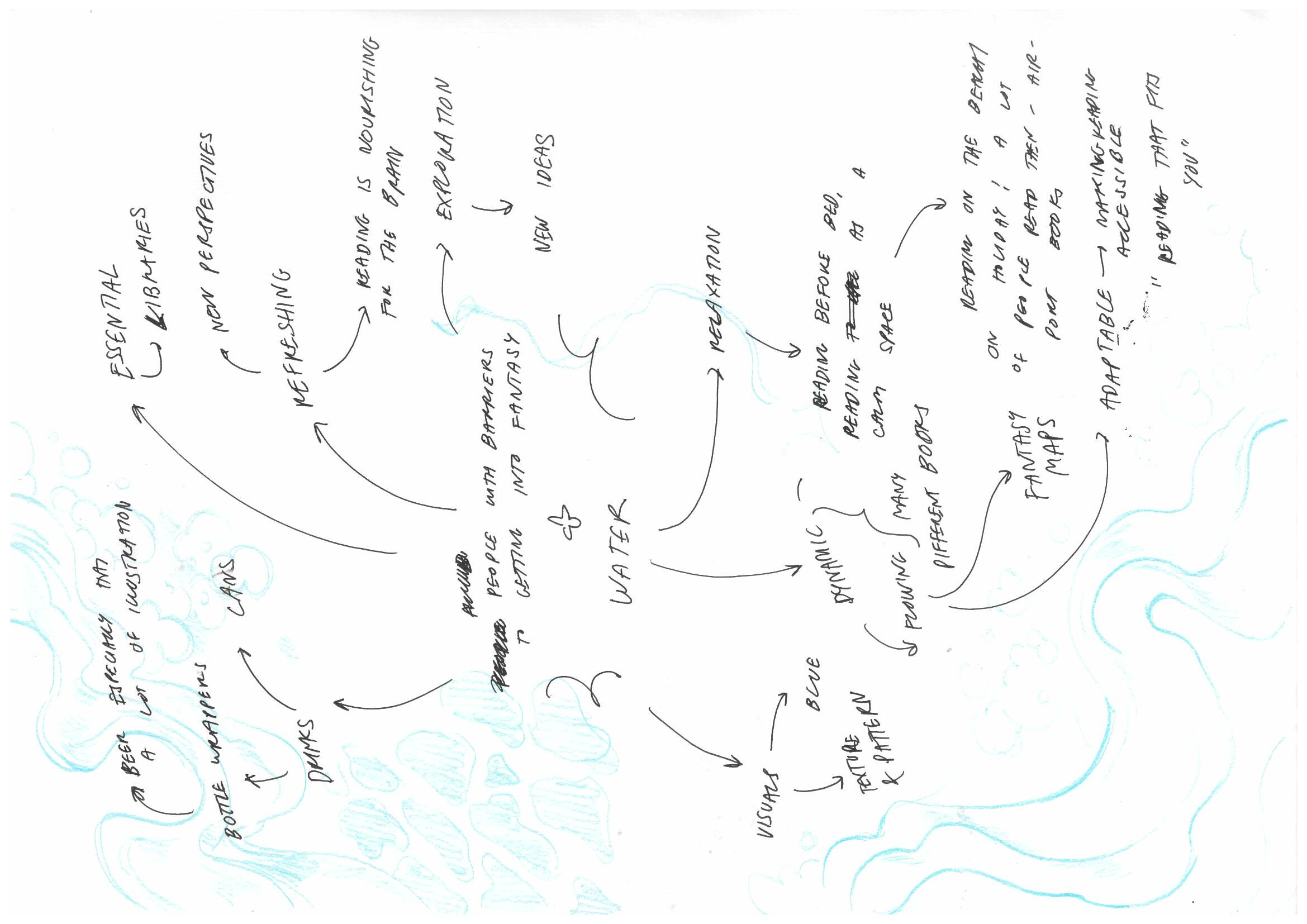
After all this feedback, I'm trying to establish where my project will go next. I think it's been a bit scattered and I need to zero on ideas, and also get some visual research going for where I'm taking this visually. I did some mindmapping (love mindmapping):
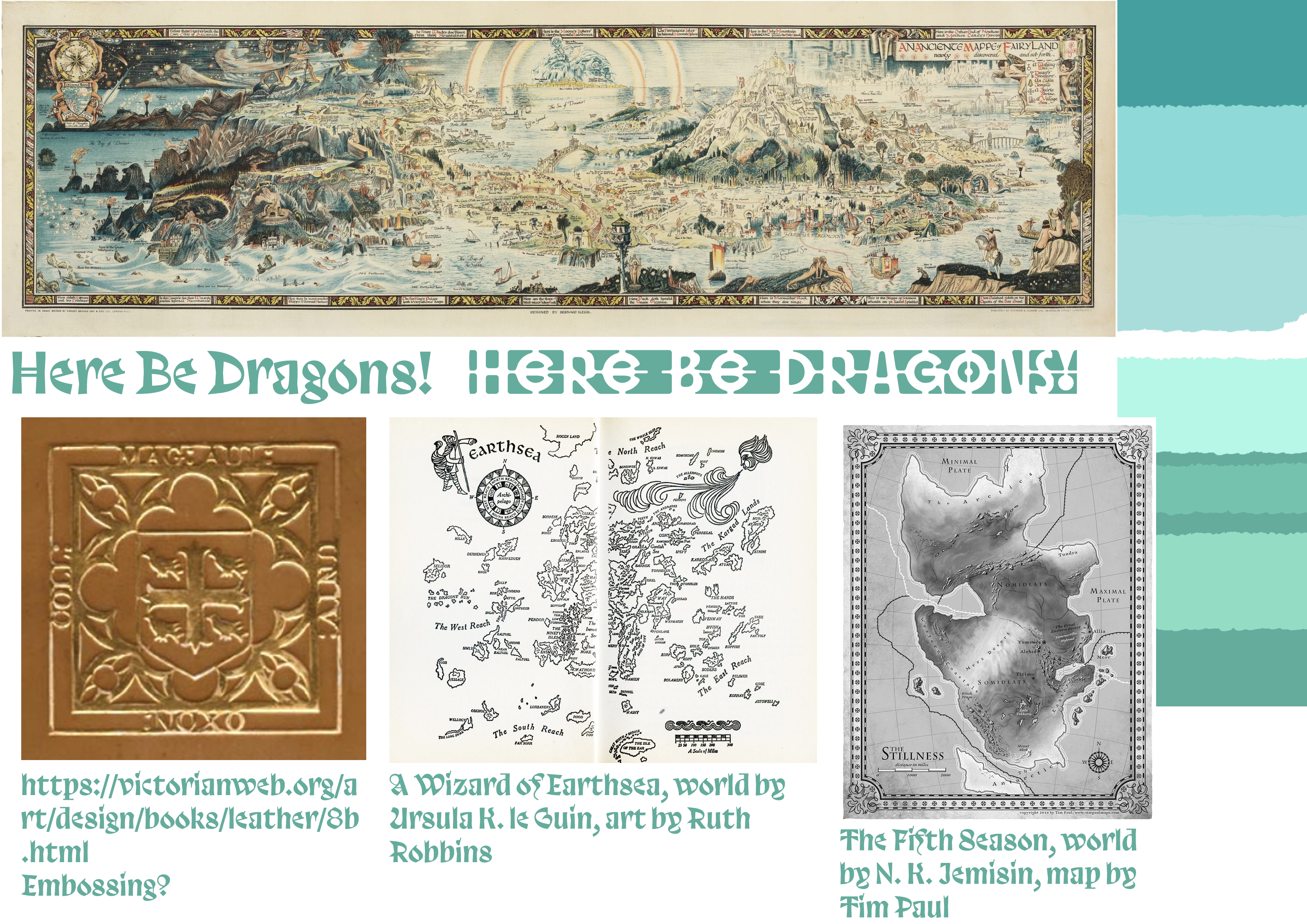
And I also started collecting some visual references. The map at the top is Bernard Sleigh's Map of Fairyland, which I saw at the Fantasy exhibition and has majorly inspired this project. The colour schemes are playing around with calming, refreshing colour schemes that link to my theme of water. I picked the name 'Here be Dragons!' because of its association with maps and also with fantasy. The 'here be dragons' inscryption didn't actually appear on more than one vintage map, but sea monsters and dragons were illustrated on maps to imply unknown or unmapped areas, or just for decoration. I think it's fun and enticing, and implies adventure.
The two fonts are from the Velvetyne type foundry, which we were linked to in a digital session all the way back in Intro to IVM (that feels so long ago now!) I've wanted an excuse to use either of these two fonts for a while, respectively Trickster and Hyper Script - they're both really exciting and artistically lovely fonts to me. I think they'd both fit well in this project, but for now I'm going with Trickster, as it's more legible & less intimidating.
I've floated the idea of including embossing in my project, but I don't want to put too much workload on myself if it's going to be a long and difficult process. I randomly stumbled across The Victorian Web, a site with a great book design section, including lots of embossed books.

Digital session in the afternoon! This was an induction to using Illustrator for lasercutting. I've done lasercutting in Intro, and had to use Illustrator for that, but I relied on the image trace function and I'm not very familiar w/ the program. This was a good time to just play around in Illustrator and get some practise using the tools and making shapes. I learnt how to use the Pathfinder function, which was very useful. Here are my shapes.

oh my god theyre so small
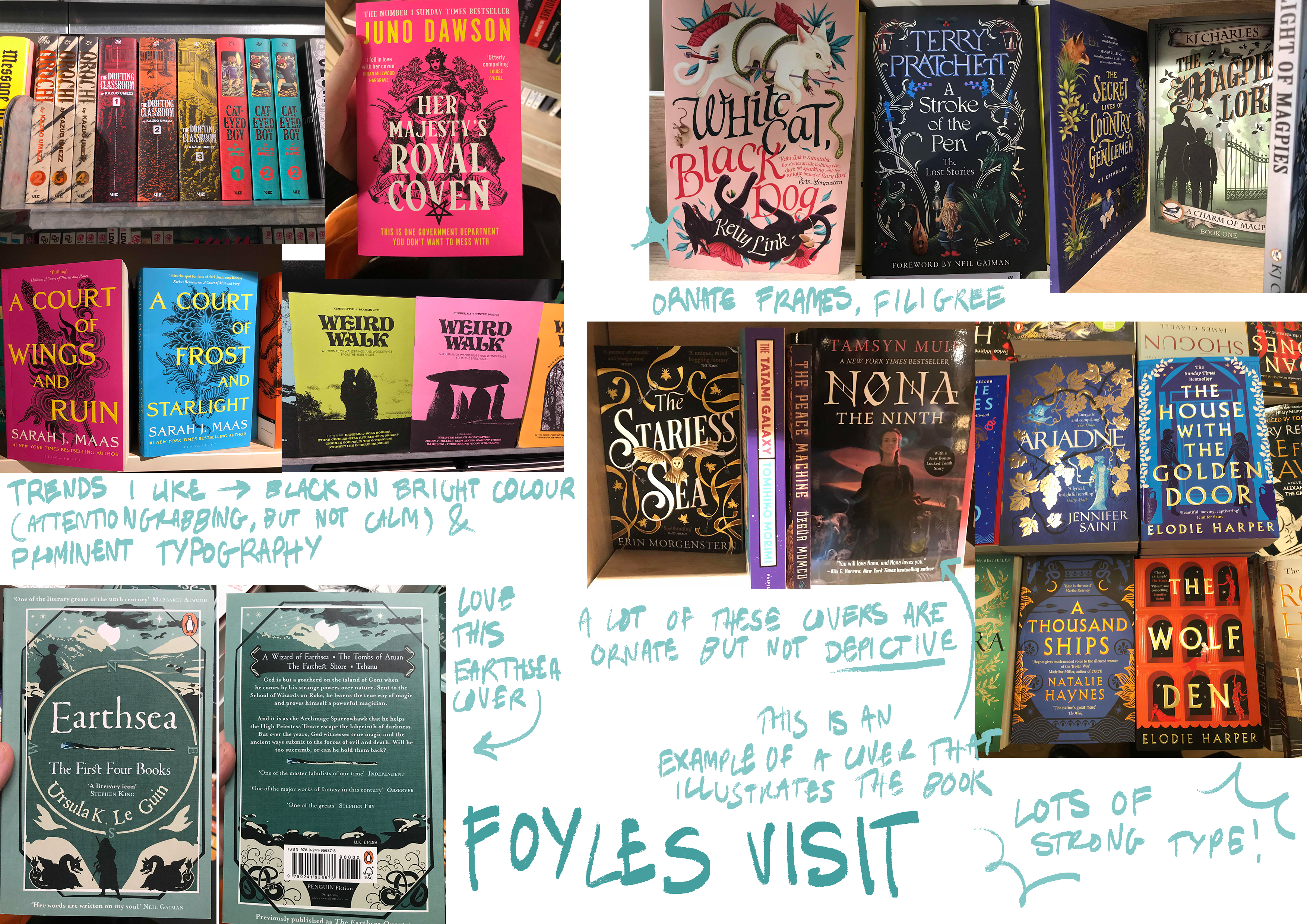
Sunday 18th Feb [written weds 21st feb]I visited Foyles bookstore in central London, to photograph cover design trends and gain inspiration for my visual direction. I took lots of photos, and observed lots of interesting trends, and I aim to write them up on Monday.
Week 18
Monday 19th Feb [written weds 21st feb]To prepare for playing around with designs tomorrow, I wanted to gather some visual references and research to draw from. I supplimented my map research yesterday with some more fantasy maps from books I've read and enjoyed, including The Fifth Season by N. K. Jemisin, which I've picked as my case study book. The two book maps have lovely defined lines, as well as illustrative borders and compasses, and I'd like to include those elements in my work, as they help lend a sense of immersion to the map.
I compiled the photos I took of various book covers at Foyles, and tried to find visual trends in modern fantasy book publishing that I could draw on. My observations are noted down on this photoshop canvas. Some of the trends I noticed that I'd like to include is strong typography, filigree/decorative/frame elements, and prominent colours used on the cover.
I've been feeling like this project's been, a little bit scattered? It's been enjoyable, but I think it's the time where I really need to consolidate my ideas and get working on something. Up until now, it's been kind of unclear what my project actually is, and I think that's also because I want it to do a lot. I've decided I need to actually settle on something - it's a book club that breaks down books into small accessible chapters, with audio & ebook versions, and provides summaries and content warnings. It's... I don't really know how good it is of an idea, so I'm having doubts about that, but this project isn't about that, it's about the illustration. I don't know, I'm enjoying this project, I'm just not particularly sure how good my ideas are, and the short timeframe is putting me under pressure to hurry up with it.
For tommorrow, I wanted to prepare some visual references for my water theme. I used reference images on Unsplash for water reflections and bubbles to help me draw, and just played around trying to create imagery.
 Tuesday 20th Feb [written friday 23rd feb]
Studio lab tiiiiiiime. Here are the initial sketches I did, pulling from my previous references. I do really like the textures and ideas in these.
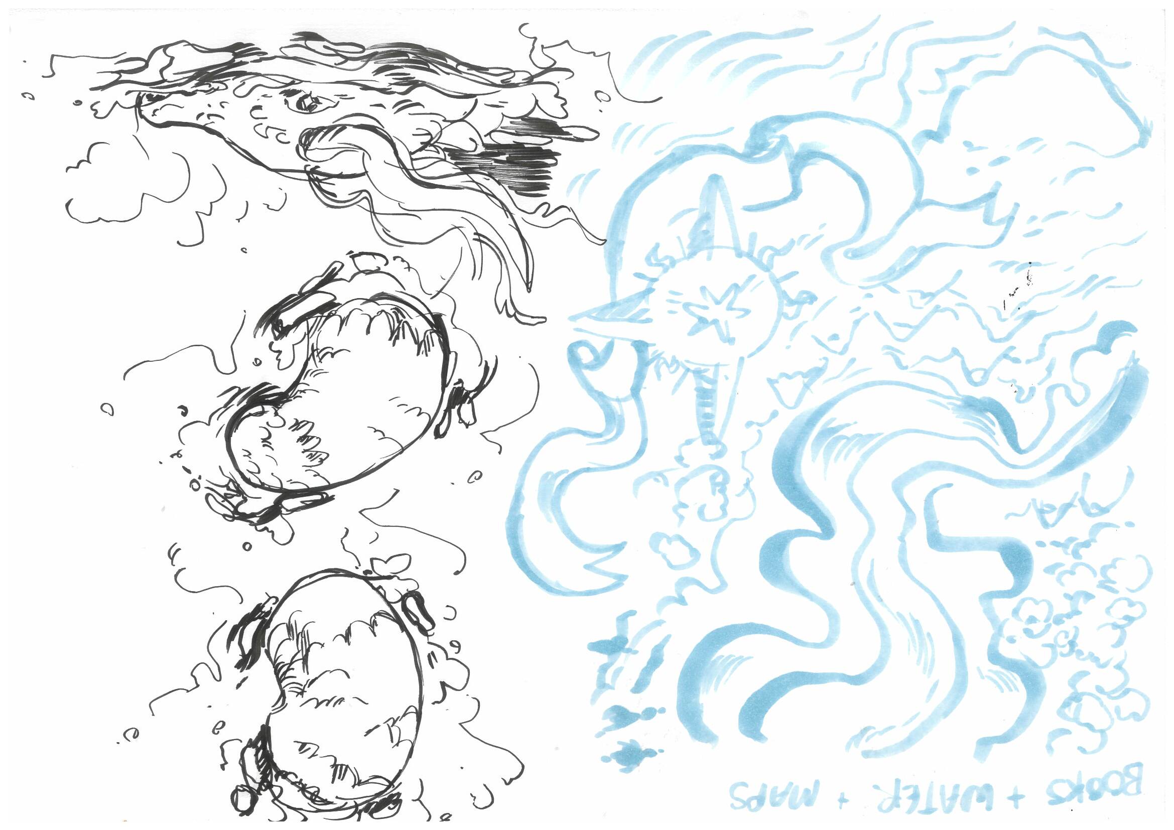

I picked the shallow gift box, since it made the most sense for a book, and I want to try and make something simple and stylistic, not luxurious and intimidating. It looks like a book! Perhaps this is an uninspired choice, but none of the other options felt like they fit. My first drawing was taking the map motif, drawing it on the net. I wanted to create something that flowed around the box and worked with the 3D form, but it was a little difficult to see how things come together just flat.
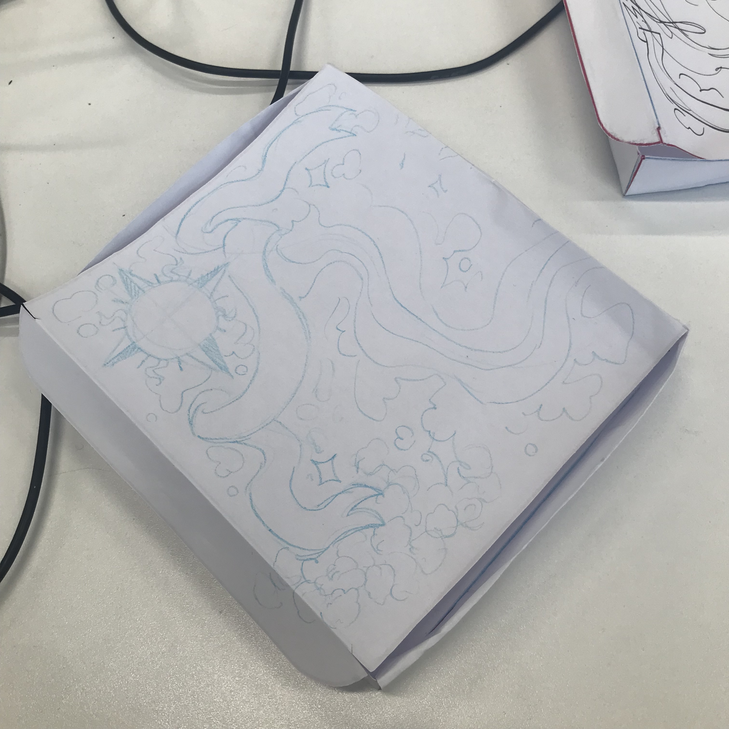

Then I did the exercise drawing on the folded net, I found this more difficult since the paper we were using was thin & flimsy. I tried a different motif with this, drawing dragons, because they're referenced in the title but not in the project. I wanted to continue with the same idea of the design 'travelling' across the box, and I think it would work well with the typical sea-monster 'curves sticking up above the water' style.

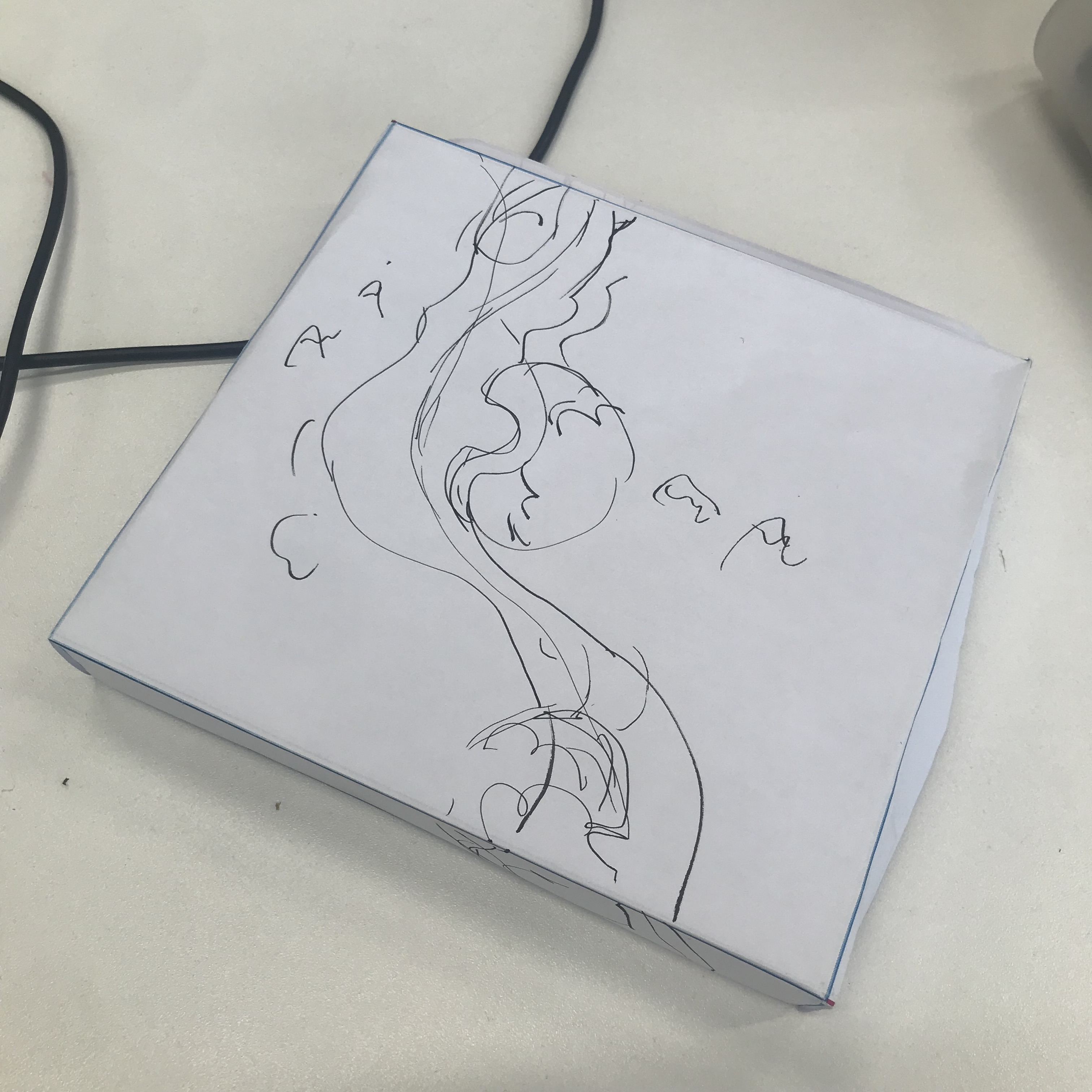
I liked where these ideas were going, so in the last bits of the lesson, I picked up my laptop & did some more little concept sketches, thumbnailing possible designs & motifs I've referenced that I could use. I picked some fonts (Trickster as previously mentioned and IM Fell English DW Pica - I like both of them & think they fit the fantasy theme, my only concern is that they feel too English for a product that's supposed to be socially concious and including underrepresented voices in fantasy? But they do get the job done r.e. connoting fantasy.)
 Wednesday 21st Feb [written thursday 29th feb]
Had CTS, updated this blog.
Thursday 22nd Feb [written thursday 29th feb]Started off my morning by drawing some designs. I wanted to create this movement all the way around the box that guides the eye, and with my references in mind, I drew these fantasy map designs. They were feeling quite bland, so I played around with decorating them - using a frame border or decorative filligree elements innspired by map decorations, both elements I'd noticed on many books in my research on Foyle's. I also played around with border designs, perhaps to put around the imagined 'page edges' of the book box, as sprayed or painted edges is a common thing in luxury books.

As you can see from my notes, this just wasn't feeling right when I drew it... it reads pretty boringly & doesn't include much of the water motif I was going for. It's not very engaging or fantastical, and I worry it comes off as intimidating to new readers. I wasn't sure where to go next in the moment, so I decided I'd take it to my tutorial on Friday & get some feedback then.
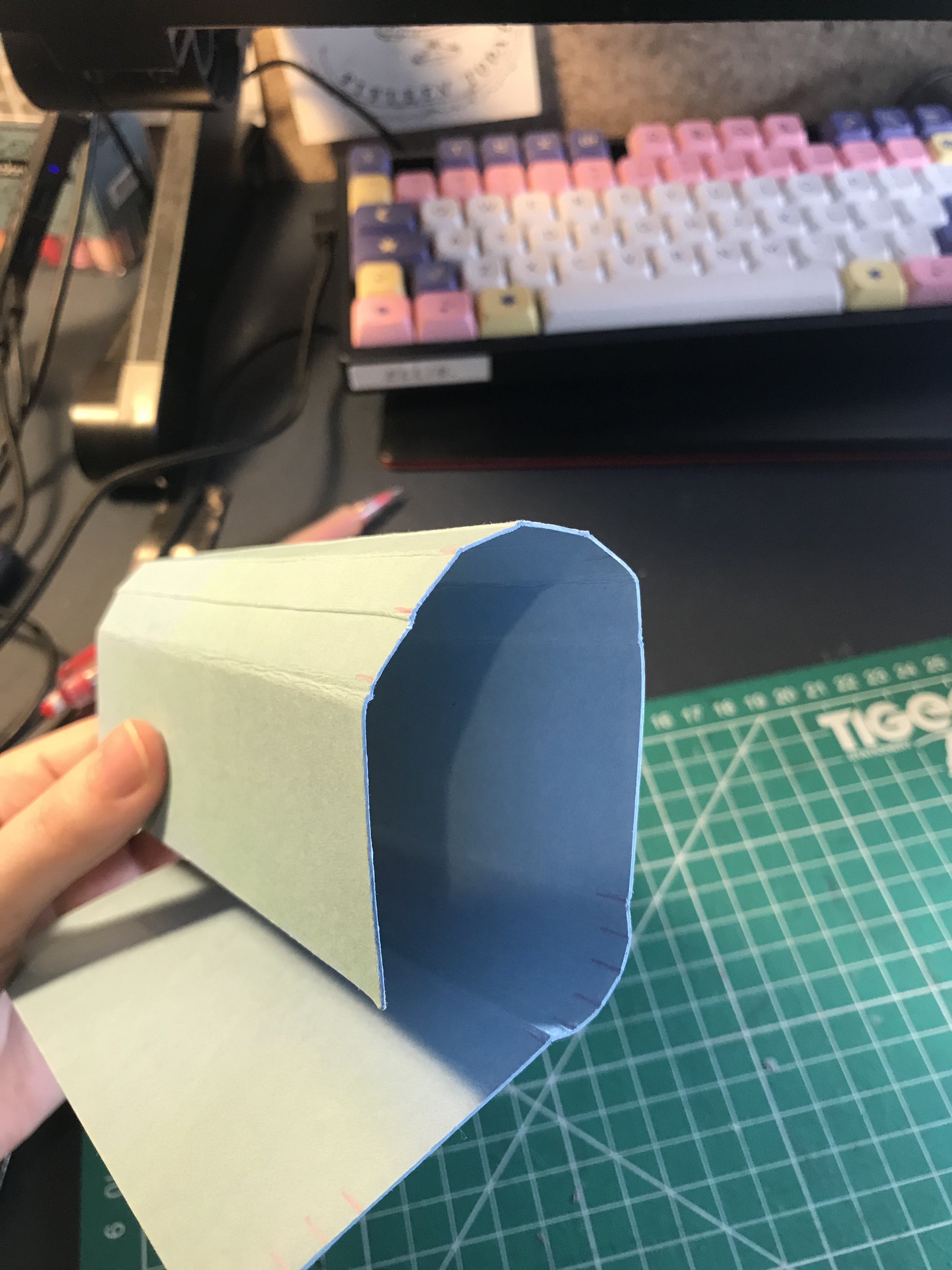
I then decided to test out something I had an idea for ages back - inspired by that wooden box in one of our studio sessions that had the curved side that I posted about a while ago. I thought the curved 'spine' resembled a book and it would be a fun touch to add to my box. I played around with some spare blue card I had, measuring & scoring lines to make the card curve - not as curved or elaborate as the box I was inspired by, but worked well. I discovered an odd number of sides works better than even.

SoM in the evening! I enjoyed Lewis Davidson's work, it was super intruiging to me as a known lover of science fiction, but it wasn't super relevant to my project. Seeing Kalina Pulit's work was very interesting, as I'm interested in art direction as a future career path. I liked seeing Kalina's moodboards and hearing about the process they took to respond to briefs.
Friday 23rd February [written mon 4th march]Going into this session, I was feeling quite lost and unsure about my place in the project, and I was hoping a tutorial and some criticism would help me put my ideas more on track. The other students in the tutorial really liked the project concept, but some found the map design too intimidating, while some really liked it. It had a lot of overwhelming information & detail on, and since I wanted to market to non pre-existing fans, I want to go for something simpler and more welcoming. Eleni suggested I refocus more on the water theme & emphasize it. They also suggested focusing on a specific book (which I considered, but I'm a bit averse to... I don't know why, I just don't want to specify down,) as well as considering transparency & colour.
I definitely came out of that tutorial with more ideas! I'm still a little frustrated that I'm not going to have the time I would want to play around with materials and use the 3D workshop, but it is a very short brief. I sat down and did some more sketching, trying to focus more on the water element and a more abstract approach to maps. I used https://www.templatemaker.nl/en/ to create a shallowbox template, using the A-format size of book - a smaller printing size that's portable, inexpensive, and typically used for genre fiction as opposed to literary works.

I showed this sketch to classmates and they seemed to really like it - I think it has more dynamism and motion, and still feels kind of geological, with the seafoam at the bottom creating coastline-esque shapes. I printed a very basic mockup on printer paper, and folded it to see how the lines matched up on the actual 3D shape, since I wanted the design components to continiously flow around the box. I drew over the printout to correct some of the lines, and I plan to unfold it and scan it in at home.


Week 19
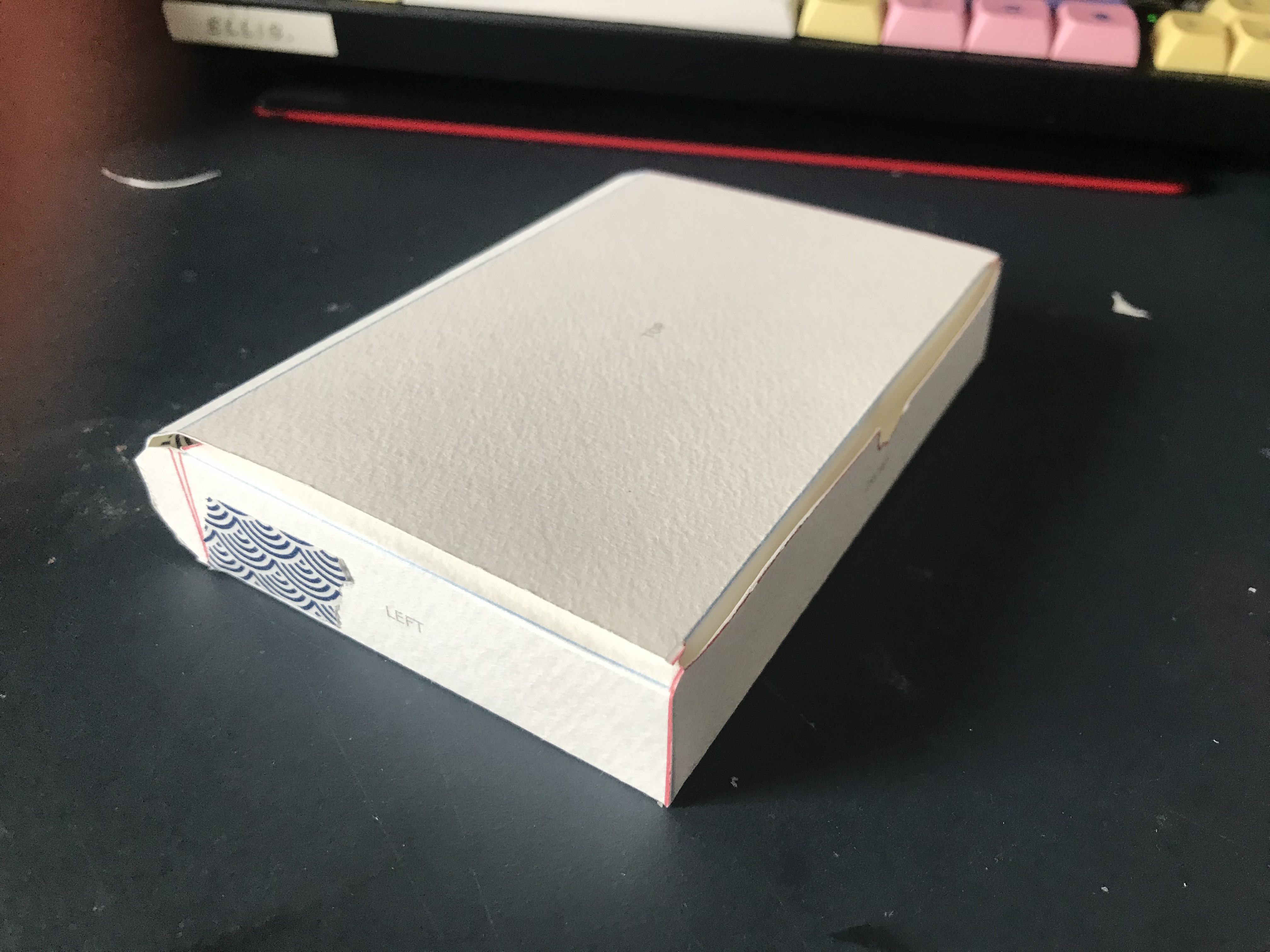
Monday 26th February [written 4th march]I made a mockup of my new box design with the curved back. It's scaled down, but I just lengthed the back side of the box and split it into 5 equal divisions. I printed it out on watercolour paper so that it wouldn't collapse & hold its shape better. I think the curved back worked really well & definitely lent it a bookish feel. Also, I think the thicker paper helped with some of the problems I'd been noticing with the paper models, namely the front of the box bowing outwards. I secured the curved back by making a tab that fills in the gap left by the curve, and then little tabs off that that stick the back of the curve, around the middle 'bar.' It's hard to describe, it worked well at holding the box together but made it a bit hard to open.

To prepare for the photograph workshop on Tuesday, I made a very bare-bones mockup elaborating on my initial design sketches. I picked this sea-green colour scheme for my general relaxing vibe, and tried to focus on flowing, geological shapes.
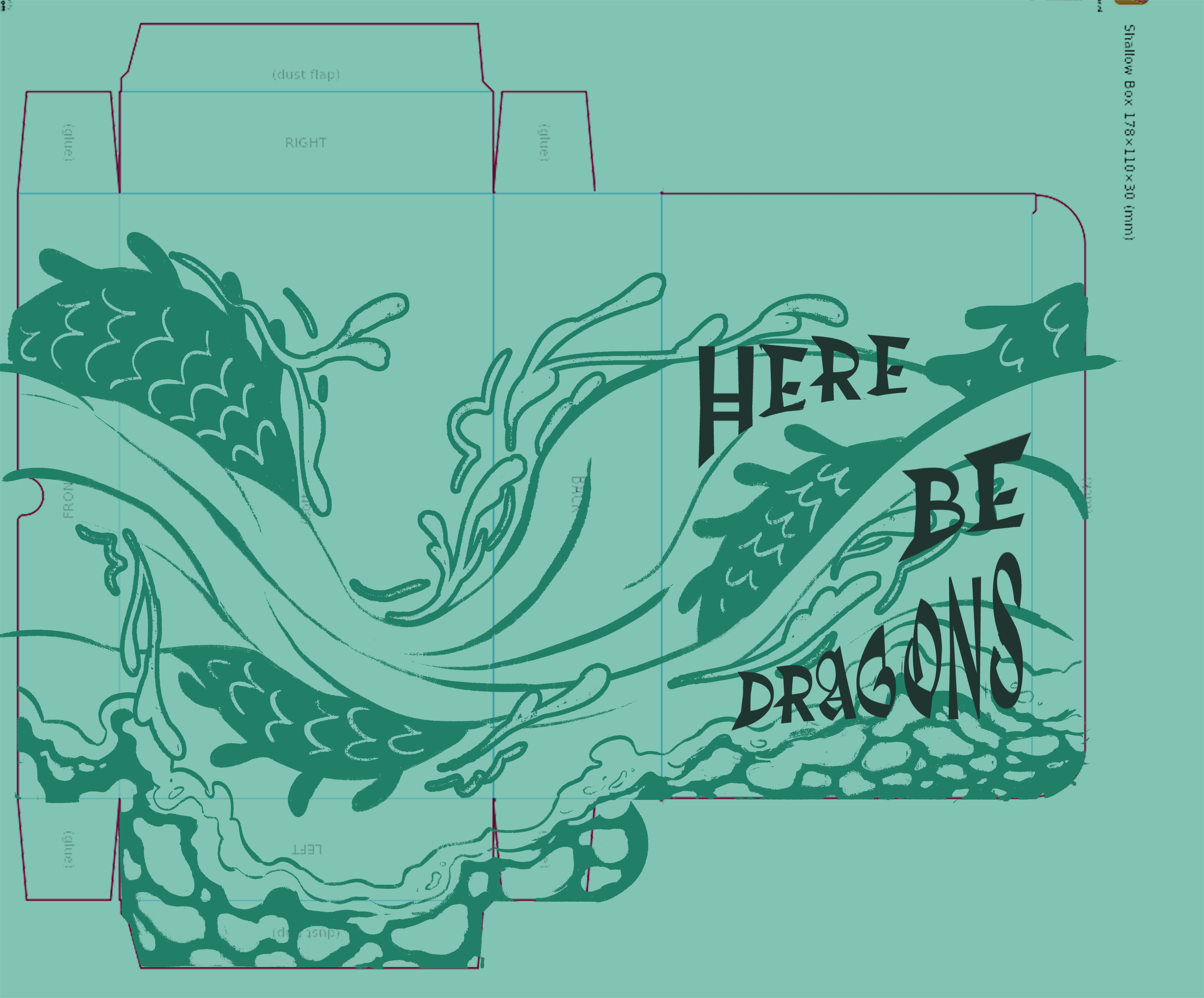
I'm really happy with how this design is looking! I used the Trickster font as I'd planned, but I also distorted it using the puppet warp tool to make it flow better with the design & for the sake of the composition.
Tuesday 27th February [written 6th march & 8th march]Printed out my net on the self-service printers in Digital Printing, with just some thicker paper they had lying around. Folded it, but didn't do the tabs that hold the curved back down. As a result, the back of the box lid was too high, and I had the same power with the front bending outwards. I also noticed that the printed colour rubbed off along the folded edges.
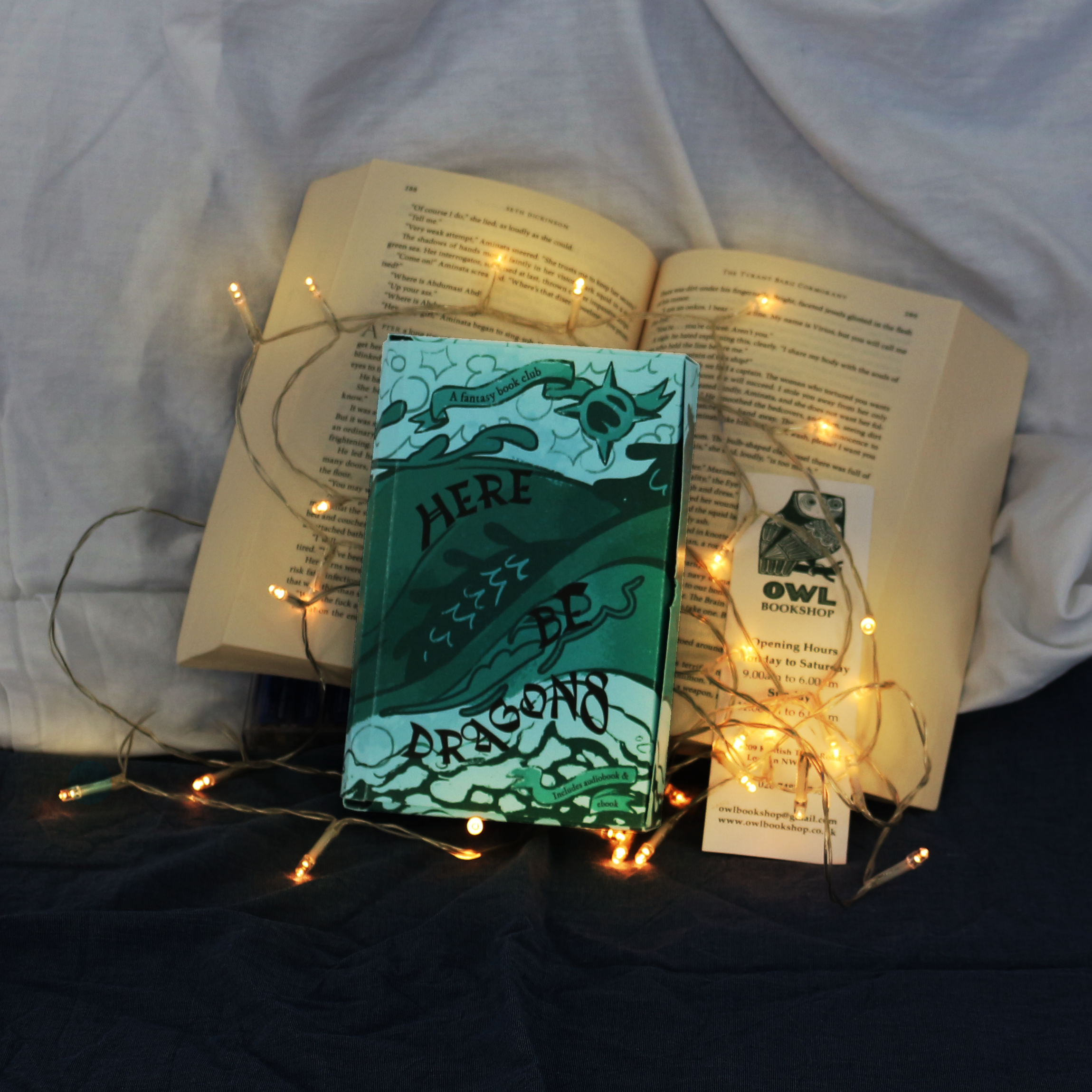
For the photo taking, I brought in props: a paperback book (The Tyrant Baru Cormorant by Seth Dickinson, an incredible anti-imperialist fantasy), a bookmark (from Owl Bookshop Kentish Town, my local book shop) and some pillowcases from my house. I was aiming for cosy reading in bed vibes.
In the studio, this was the pitch I wrote for my photography intention:
- MESSAGE: A relaxing, calming & stress-free view of reading, that’s also a little bit magical. Enjoy reading & explore new worlds with this book club
- CONTEXT: Commercial. Perhaps on social media/online? Not super attention grabbing, refined, stripped back. On the train or bus - since lots of people read on their commute.
- AUDIENCE: People who don’t read that much, but want to read. People who experience barriers to reading & would benefit from audiobook programs, reading assistance, etc. People who value new perspectives and want to read books with socially conscious themes.
- EMOTION: Calm, relaxed, stress-free. But also invigorated, refreshed, excited. Explorative & enticing, while still being chill. Comfortable, easy, low barrier to entry.
References I found for my photography:

From the designers mentioned in Kalina's presentation, I found Georgina Scott's set design for Burberry (w/ photography by Leonardo Scotti.) I really like how the mundane setting of these photographs makes the products not seem imposing, which is unusual for a luxury bag - they have this candid, relaxed feeling. The candidness & the theme of construction constrasts with what we usually expect in marketing for handbags. I really like the photo I included, the warm light is very calming, and the sheet creates a lot of visual interest with the folds.
This (right -> )is from photographer Tyler Mitchell's Dreaming in Real Time exhibition. This exhibition is very calming and bucolic, and uses lots of lovely warm light and calming, steady scenes. I particularly like this photo - the contrast of the shoes on the blanket, the colour contrast, and how romantic and sweet it feels.

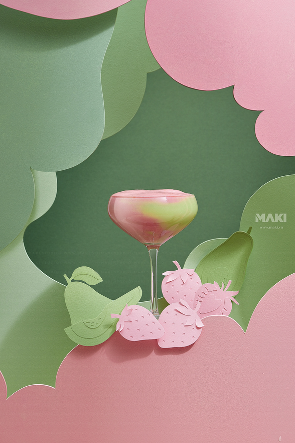
From MAKI studio, found on Behance. I liked the papercraft background, it reflects and emphasizes the product and makes it seem artsy and exciting. It's really unique and eyecatching. I don't think I have the time to do something like this, though...
Then it's photography time! I played with using pillowcases to make different backgrounds, and wrinkling them to create visual interest. I think the bookmark & book really worked as props. I also played around with using the orange films to create a warm look - I think them just covering the camera is too intense, but I'd definitely like to try and include warm light sources to really land that cozy before-bed vibe. I think 2nd and 4th on the left are some of my fabourites - I think the white bedsheet in particular really works, you get great shadows & it matches the colours of the book & emphasizes the blue.
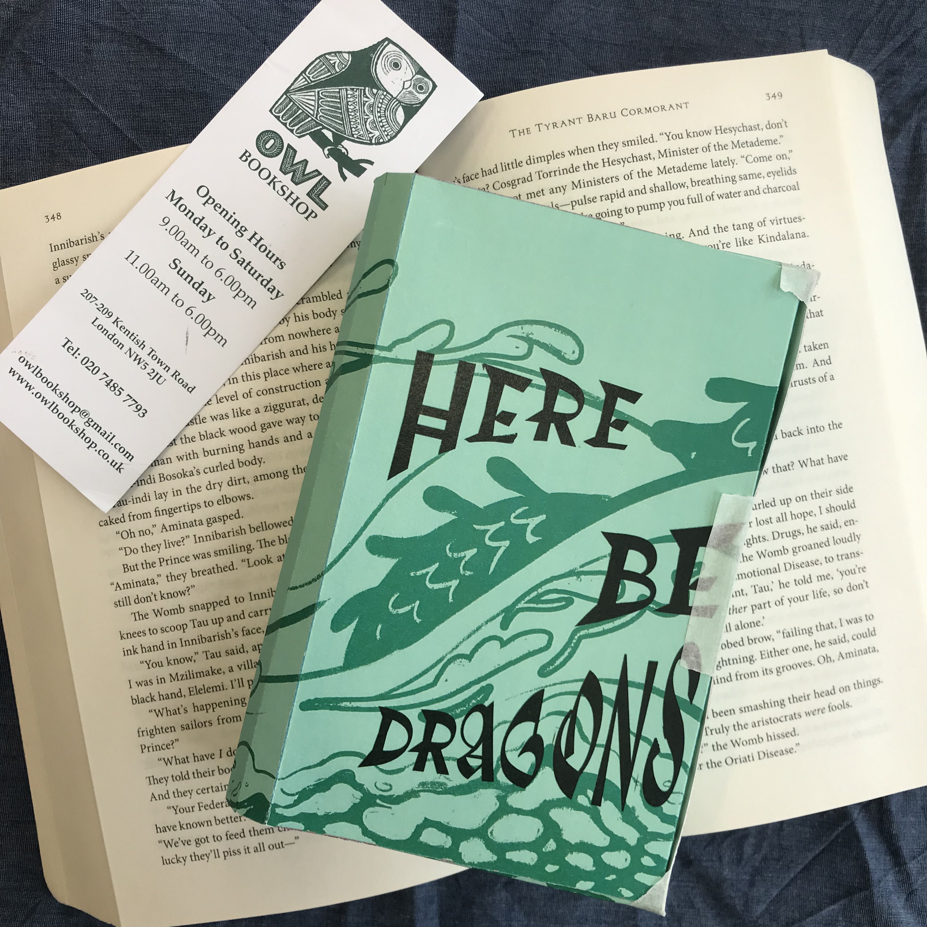
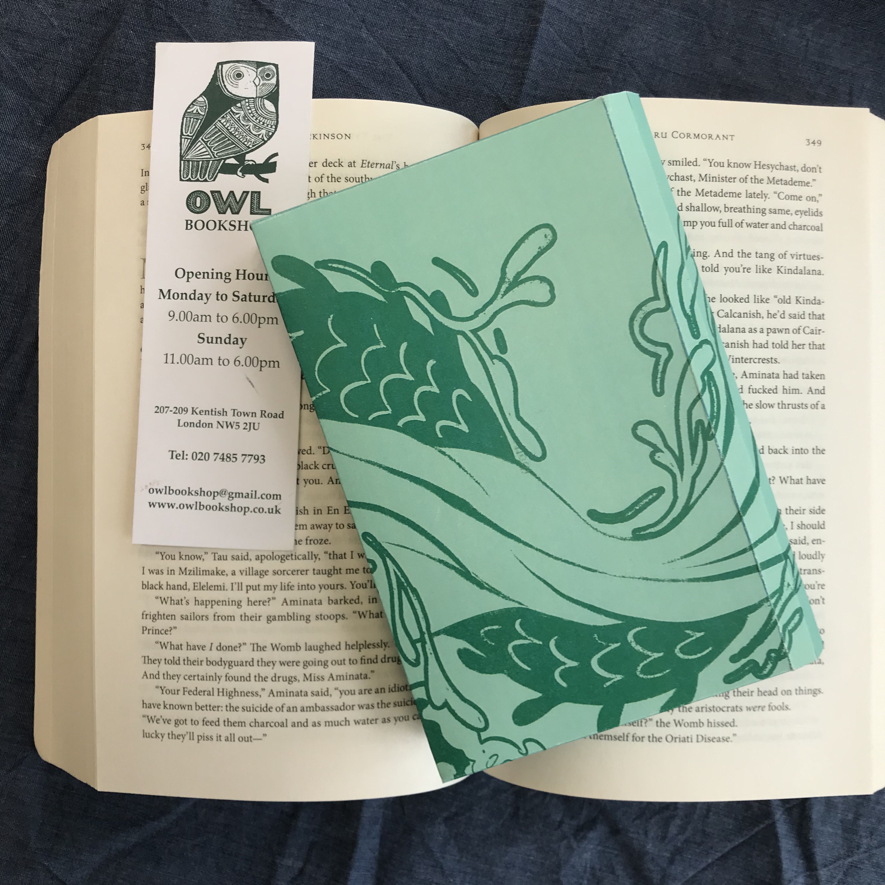

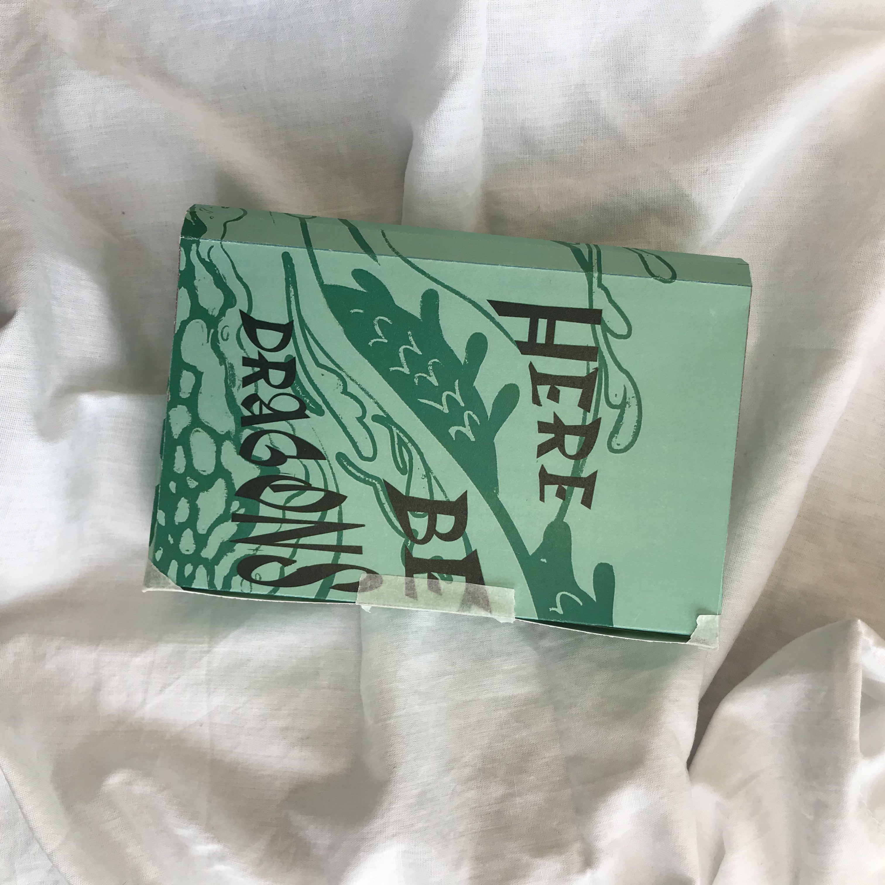
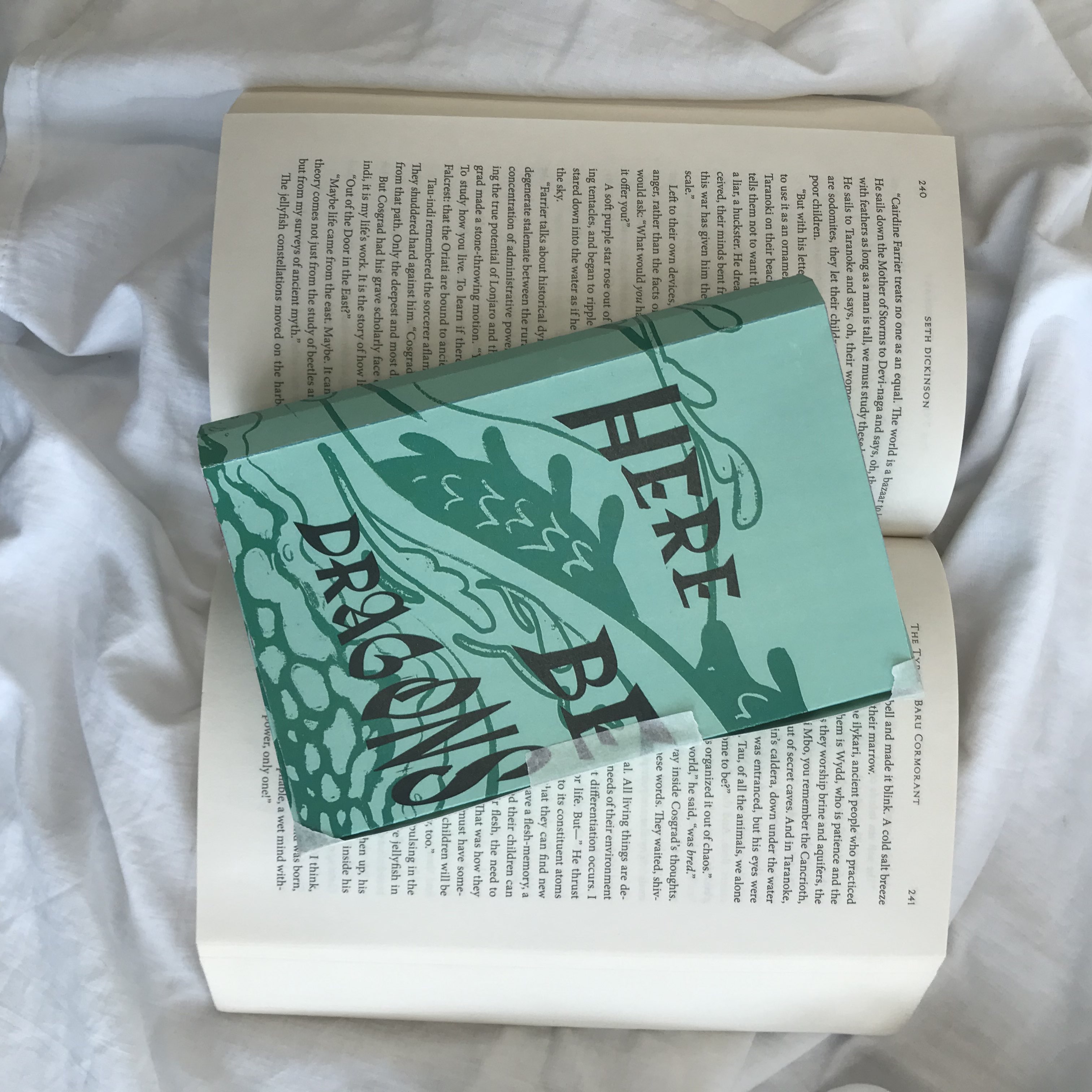


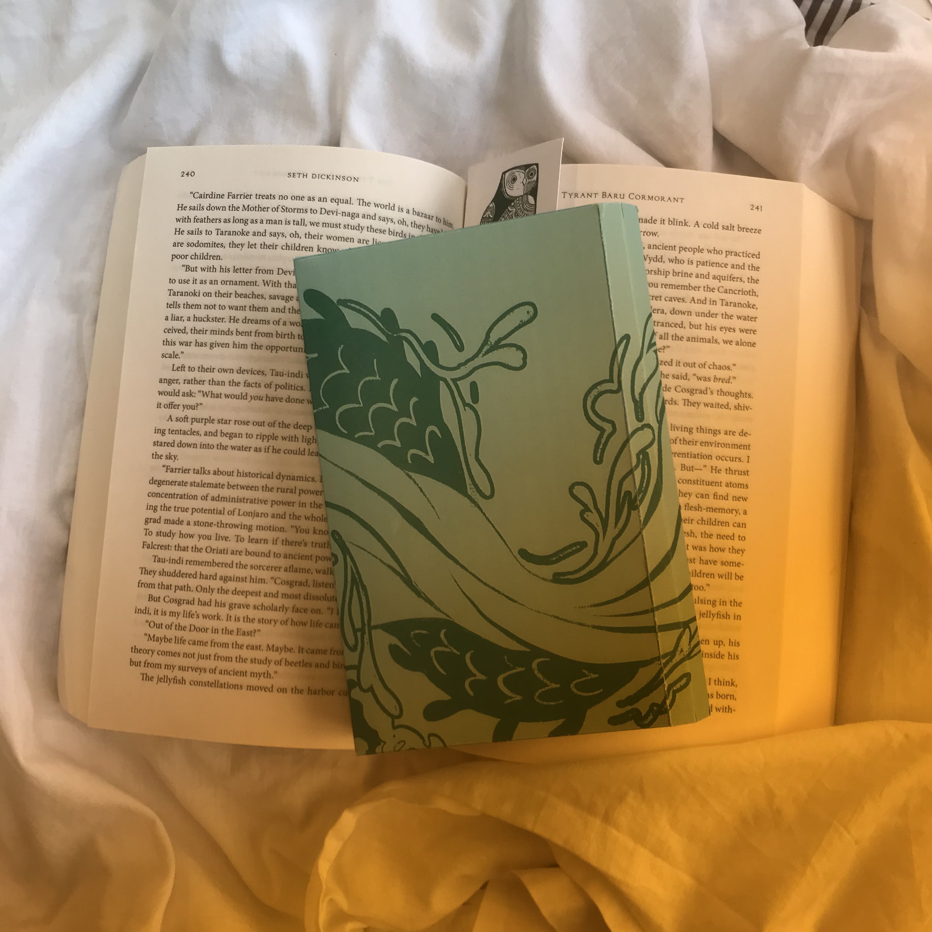
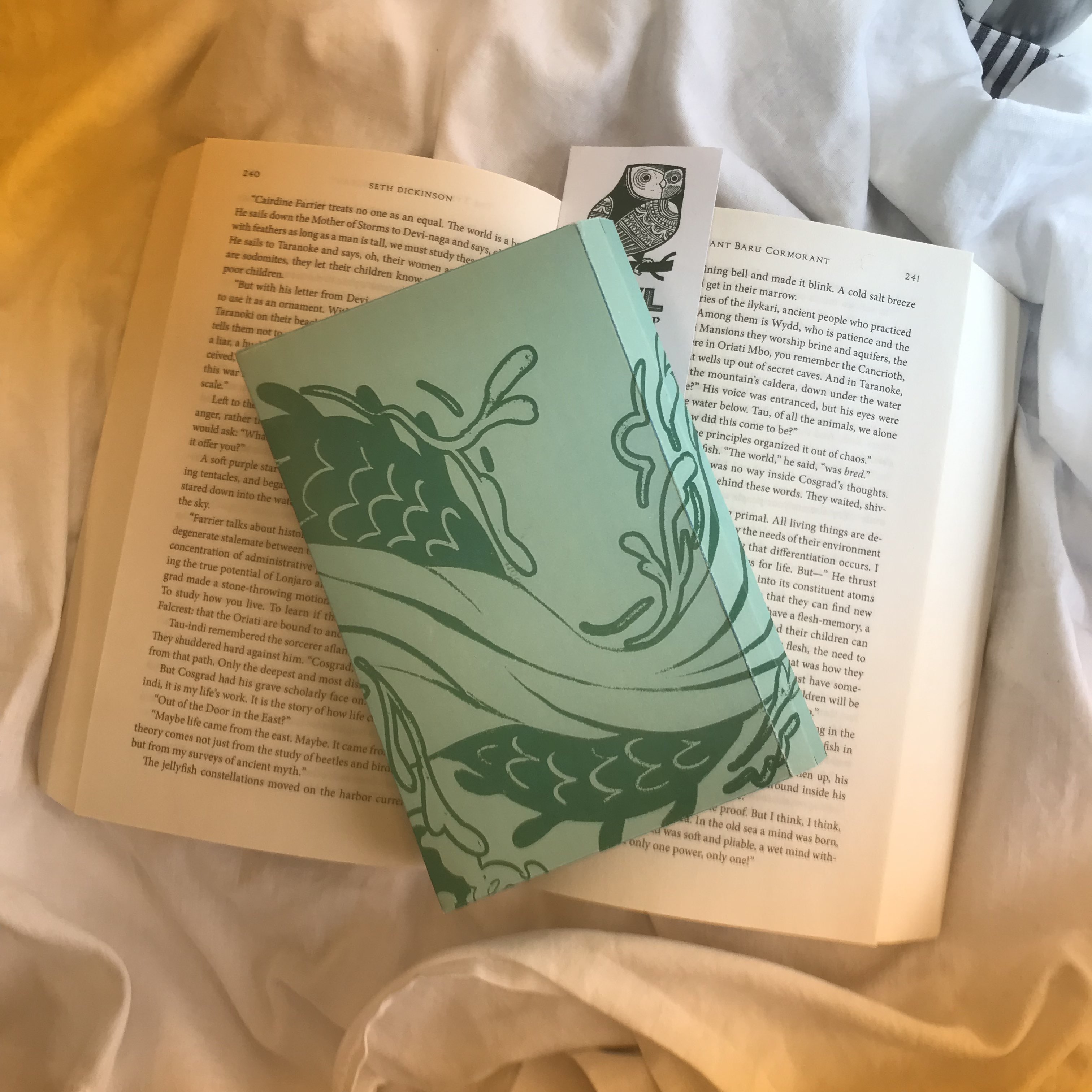
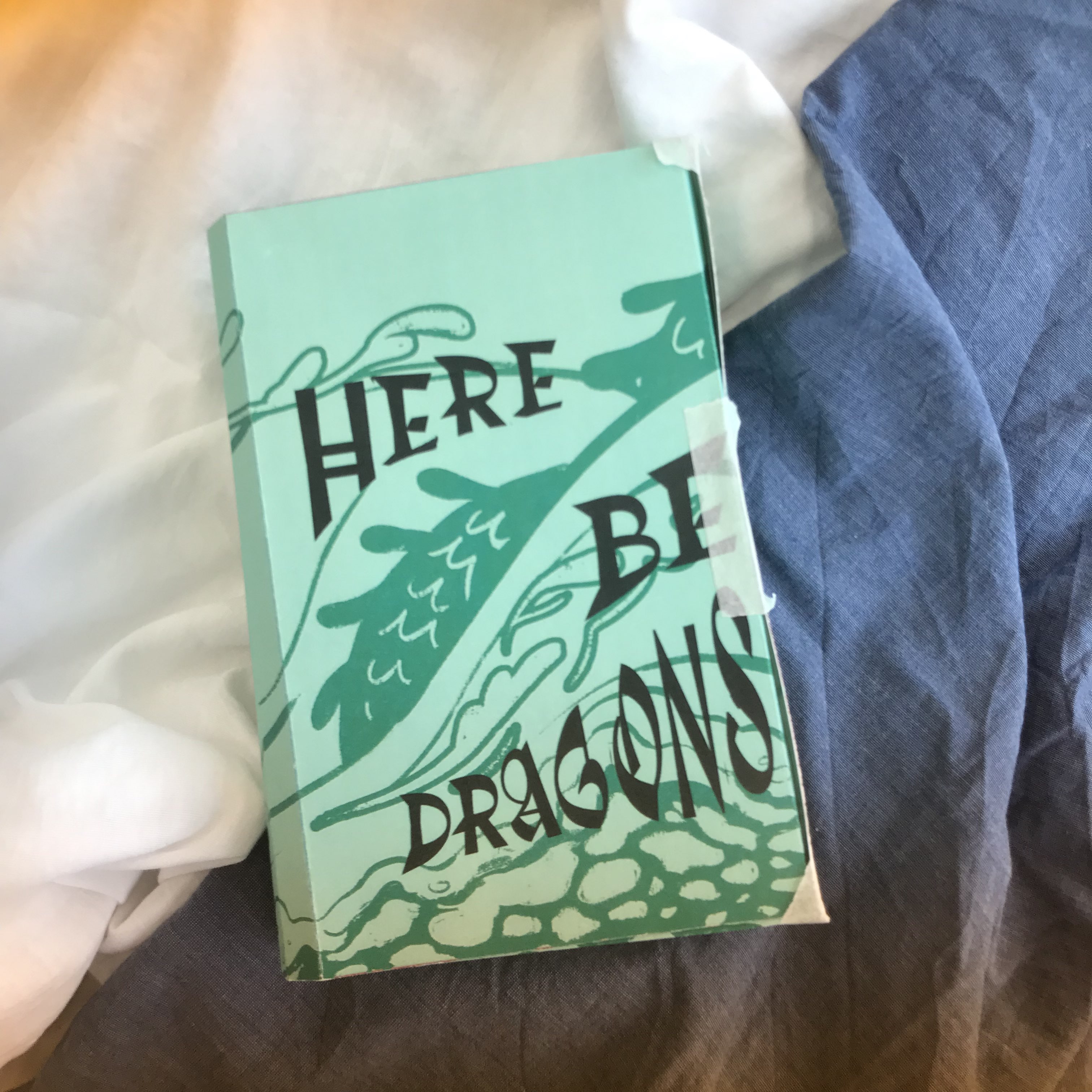

Feedback I got on my photoshoot! I'd definitely like to include some more objects for a more cozy feel, especially warm lighting... I don't know if I can get a desk lamp in, fairy lights would work, though? And give a very magical feel, especially if I could put them inside the box like a fantasy treasure chest. I liked the critique that my photos look like they belong on Pinterest - I wasn't aiming for an 'aesthetic' feel, but I was thinking of social media as the place where my images would be spread, so that's good. Otherwise, I'd like to improve on the angles a bit - some of mine are a bit awkward.
Tuesday evening I did CTS reading & looked at paper online. I was annoyed by how the printing rubbed off on the edges of my box where I folded it, leaving these nasty white marks. It looked unprofessional, and I also wanted to print on coloured card, for a more crisp, matte feel. I looked at GF Smith, because I like their colourways, but they ship online and I was nervous about it arriving in time. I found out there's an art shop near UAL that stocks the Daler Rowney Canford card (another brand I used before in Intro To) & decided to buy some card from there.
Wednesday 28th February [written march 8th]After CTS, I sat in the cafe and worked on my actual artwork. I wanted it to be flowy and textural, and keep to this blue colour scheme. I explored making the dragon parts a contrasting colour (like red) but it just didn't fit. I experimented with adding these watery textures (bubbles and waves) in groups in the top half (because it looked very empty), in a similar way to how maps have those clusters of little mountains or trees. I don't really know how well it worked? It just feels a bit off. Oh well. I added the compass rose & ribbons to bring it a bit closer to the map theme.
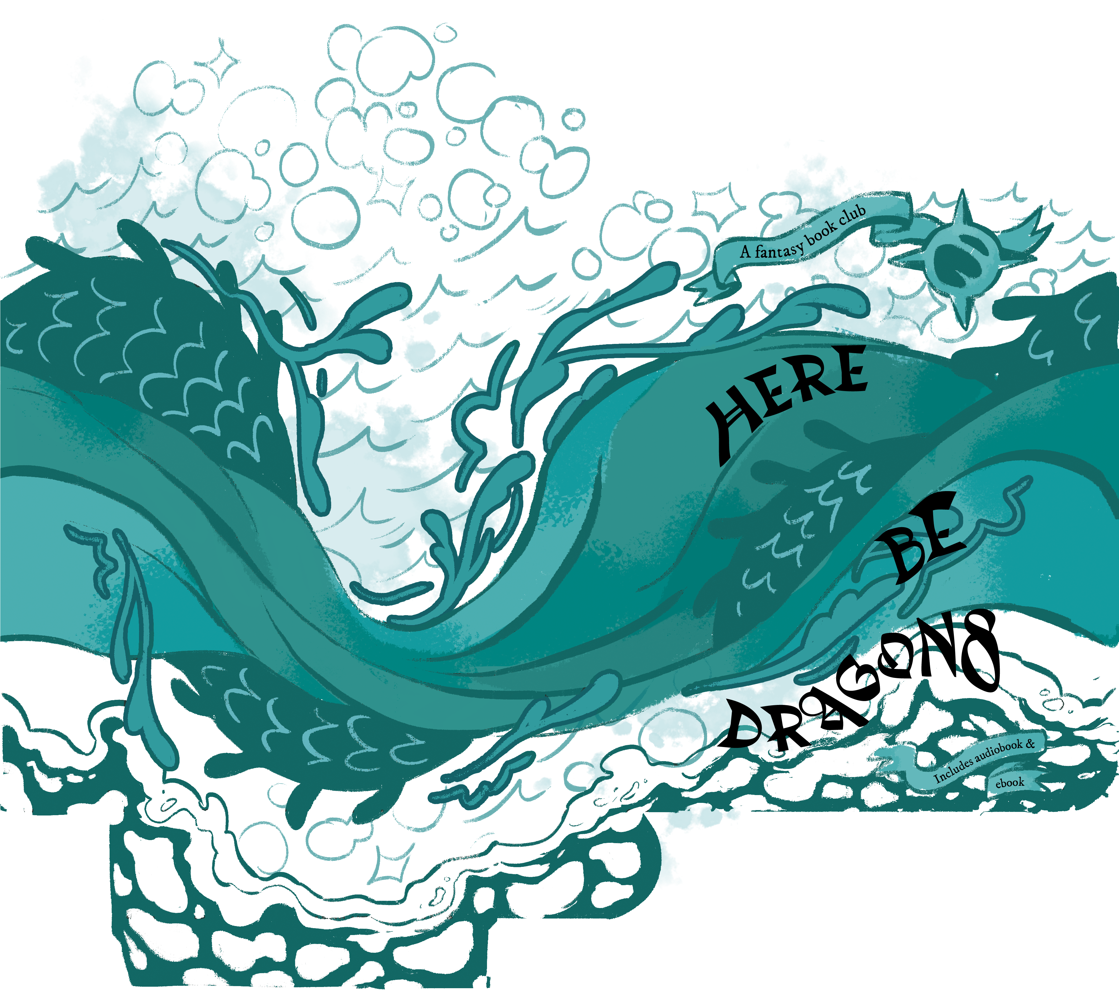
I added the text on Illustrator, using my previously assigned fonts. I attempted with using the 'envelope distort' text thing, but the letters were hard to read and didn't flow well. I then used text along a path + puppet warp to distort the text (but still keep it readable.)
Thursday 29th FebruaryI went in to LCC in the morning, and picked up some card from the nearby art shop. I then, with my prepped files, went into Digital Print to print my design. The first prints had the double-sided-ness wrong, but I got it right on my last piece of card! I then took the nets to Print Finishing to get them cut & folded on the big scary guillotine, to avoid human error. I folded a version on white card (just to see what it looked like - it wasn't great, the contrast against the white paper was off) & my final box, the blue card one. I experimented with adding a closure flap on the white box to secure it together, but it was very difficult to add one at this stage.
Video of the big scary guillotine.

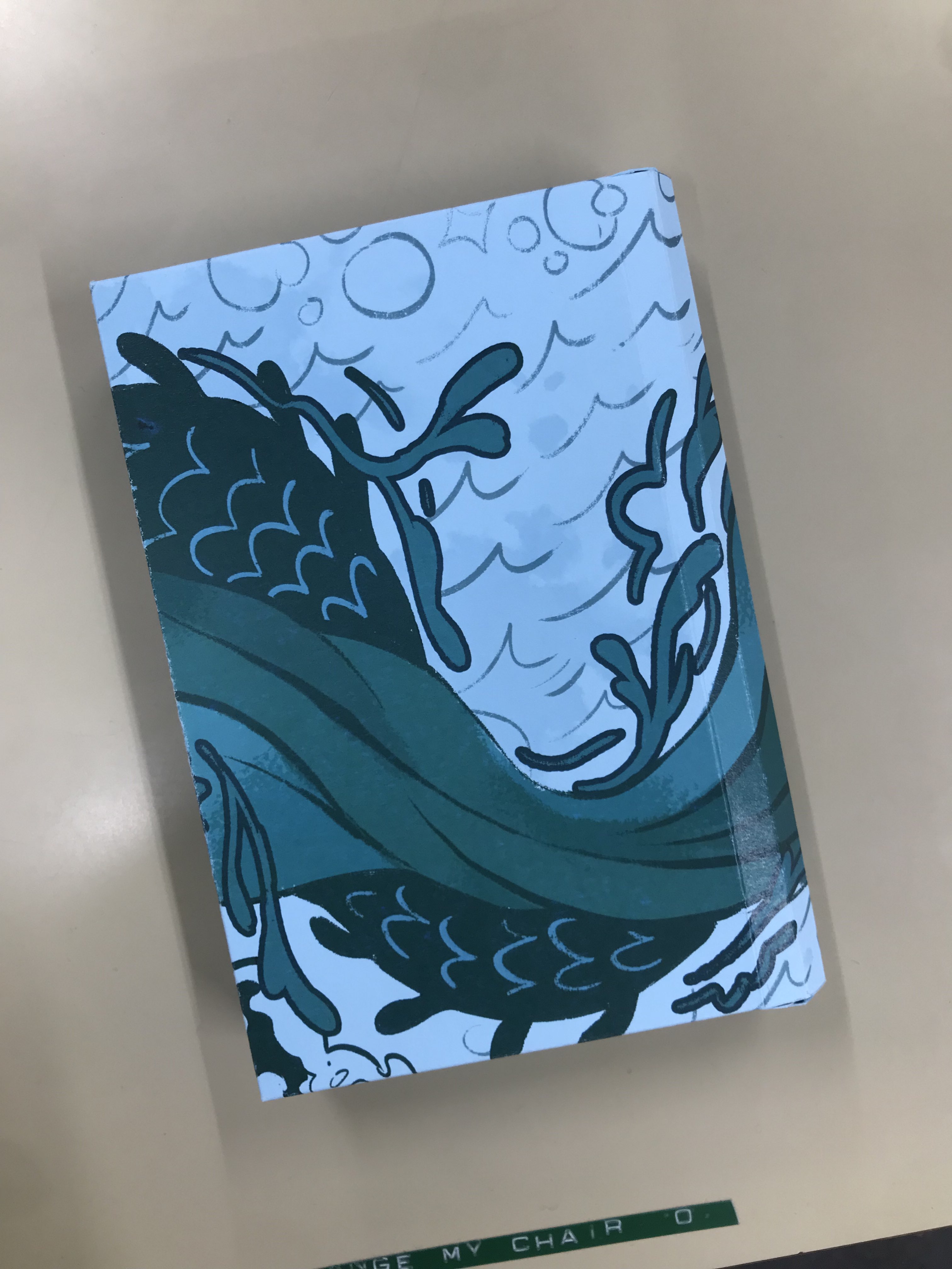


There's definitely some things I would improve in future versions - the gluing together at the back is kind of janky and I forgot about how much darker CMYK makes things. The text constrast isn't great, which is bad for an accessible product. It doesn't join up around the box perfectly, but despite that, I'm really happy with how this came out. I like the textures and shapes of the design, I think they're inviting and exciting, and the curved back creates a little touch of visual interest.
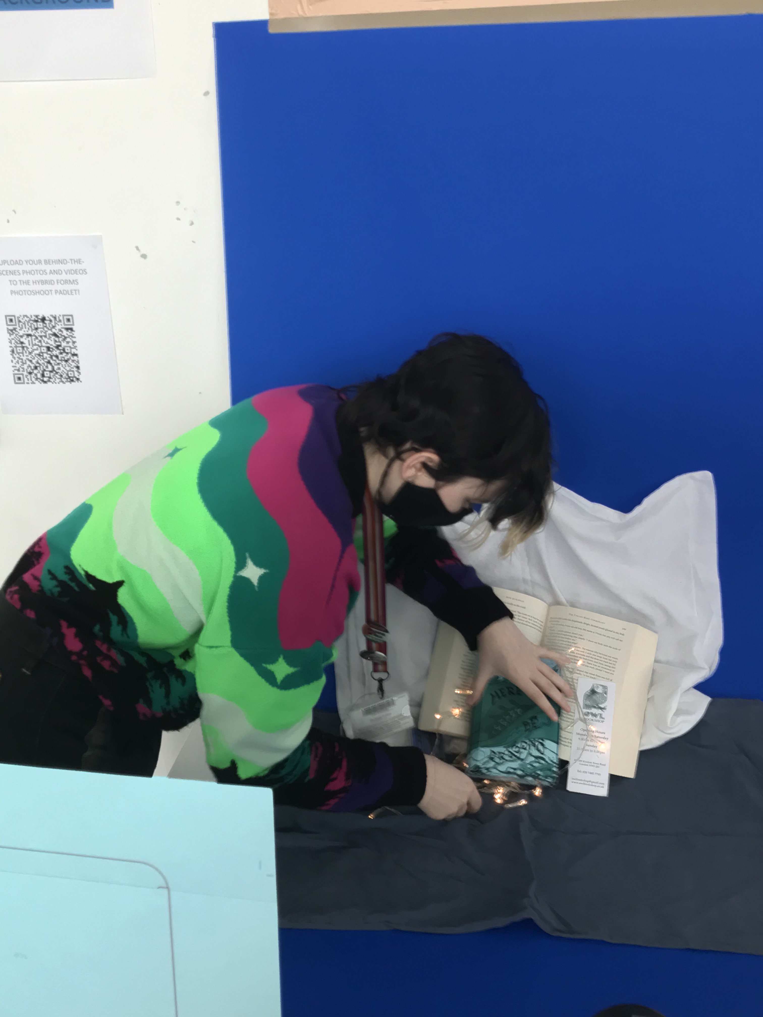
Friday 1st of March [written wednesday 13th march]Photography day! I came into this very nervous, and learning about the insane time constraints didn't help. I brought in the same props as Tuesday, but I added a little battery powered string of fairy lights, to add more warm lighting and a magical feel. The constraints on the photography environment itself was pretty severe, too - I would've loved to play around with different lighting, but I get why that wasn't possible. Unlike every other group, VJ did not allow us to move the camera in any way, which meant I had to redo my staging under a lot of time pressure and really stressed me out. However, I think I adjusted my photos well to the upright staging, and I wanted to try more stagings with the fairy lights, but didn't have enough time. Here's the photos of me taking photos:

And my photos:

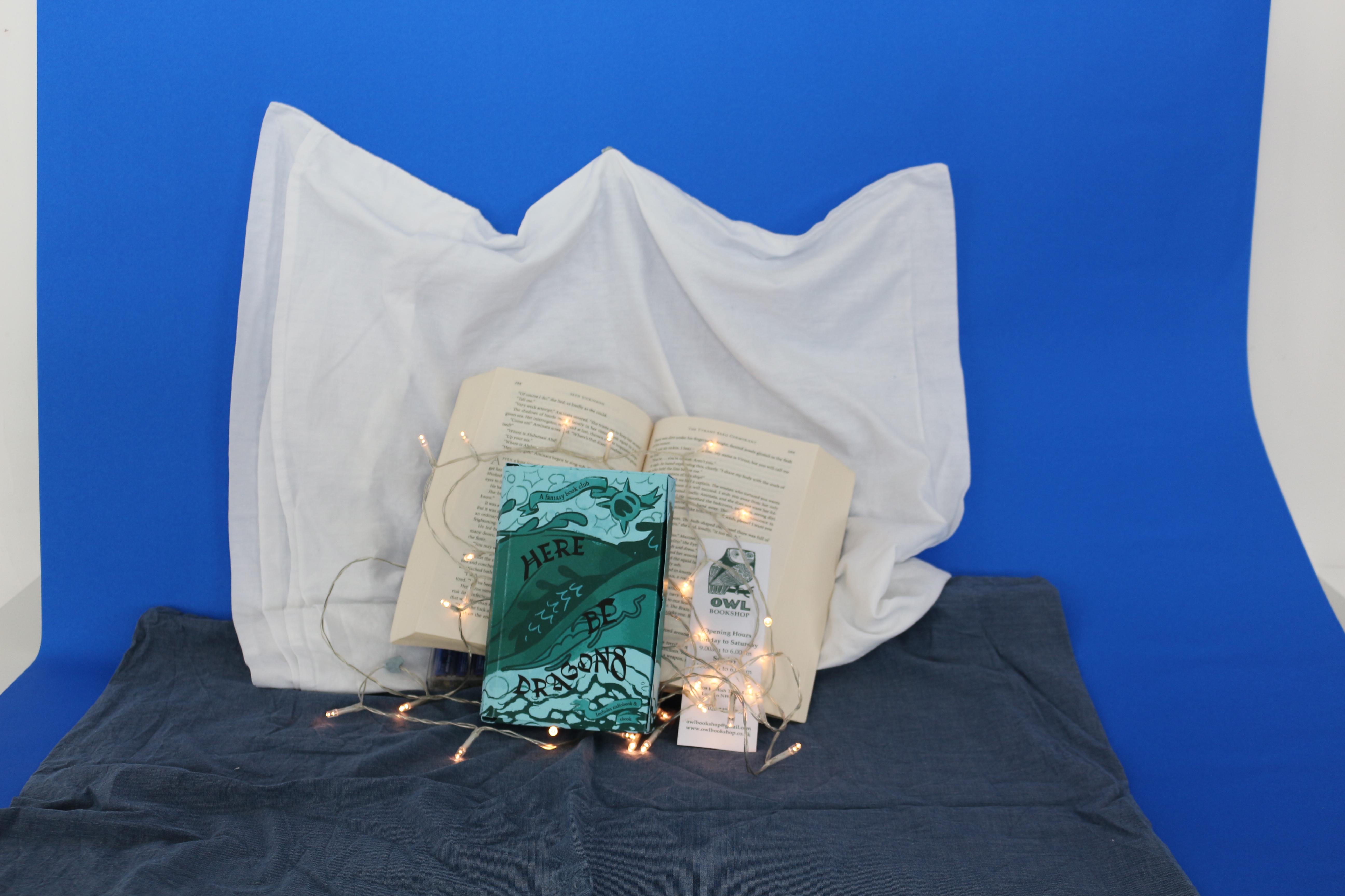
I was too stressed to remember to zoom the camera in, the first one is out of focus for the same reason. However, I do really like the second one, it conveys the right cozy vibes & I think it has a lot of potential after post-processing.
In the Digital Skills session, I used overall hue/saturation & curves editing to make the image darker, then isolated the box with a clipping mask to make it stand out more. I then used an airbrush on Overlay layer settings and various amounts of Gaussian Blur to make the light from the fairy lights stronger. I think I approximated the cozy look I was going for well with this editing and it looks like an effective social media graphic.
I also tried adding text in Illustrator using the 'type on a path' tool.

Overall reflection: I was under a lot of stress with how short this project was, but I think I produced an effective outcome that met the brief well and communicated my ideas well. I would definitely like to use the 3D workshop better in future (embossing and foil pressing would work very well with this project) and it's a shame it wasn't possible in the time frame.