Hand and Eye
Images take a while to load here. Please be patient! ^_^
Week 23
Tuesday 16th April [written 17th april]A new project! I was pretty stoked when I found out this one - finally, a comics and print one. This is very much my shit and I'm super happy to be doing it. I was immediatly excited by the prospect of making a reproducable publication and a visual narrative - but I'm trying not to jump straight into having a finished idea, right now. I'm trying to bring the ideas I want to do into the project.
These were the objects I brought in for observation - a Pterosaur soft toy that lives above my bed that I bought to help with me starting A-Levels, my favourite (and only) necklace with a long story attached to it, and the Gay's the Word bookmark I use in almost every book I read. Here they are!
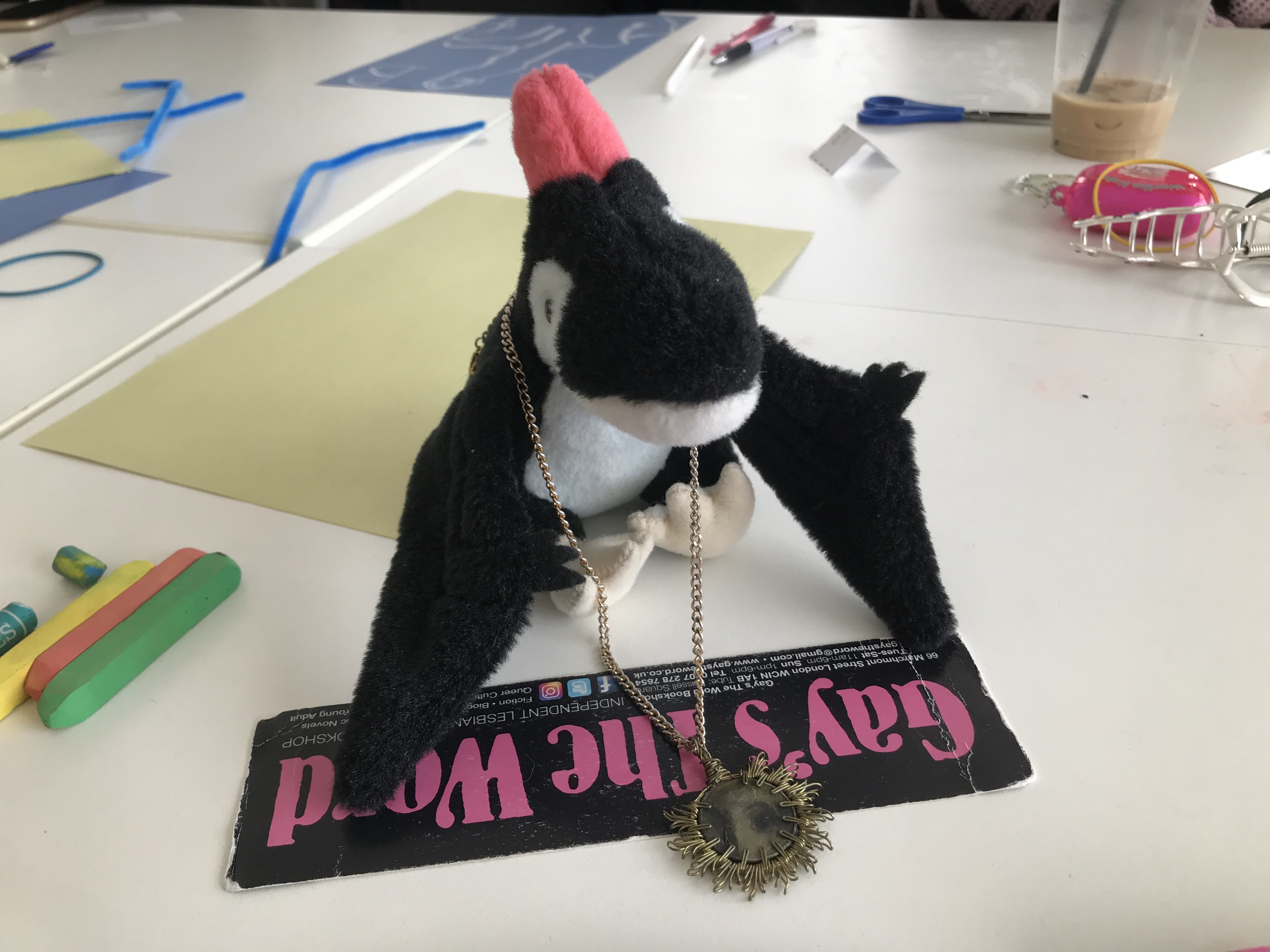
I enjoyed the drawing task, I'm always up for using fun materials and playing around. I don't draw from still life often, but I enjoyed picking compositions and details to draw, and trying to create texture and visual interest. Plus, I always love drawing on coloured paper. Binding it into a book at the end definitely created some compositions and combinations I didn't create myself, and I enjoyed that spontenaity.
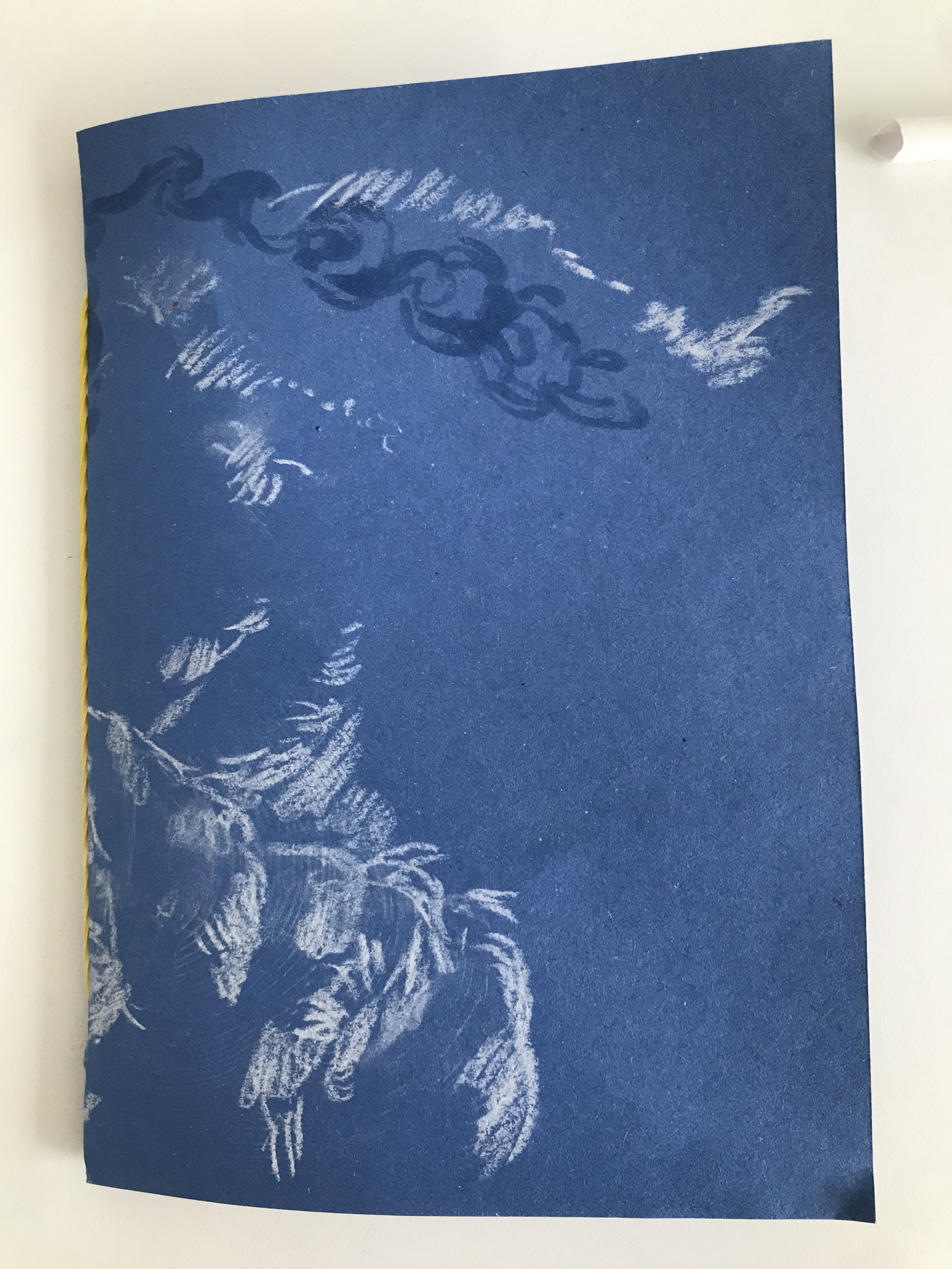


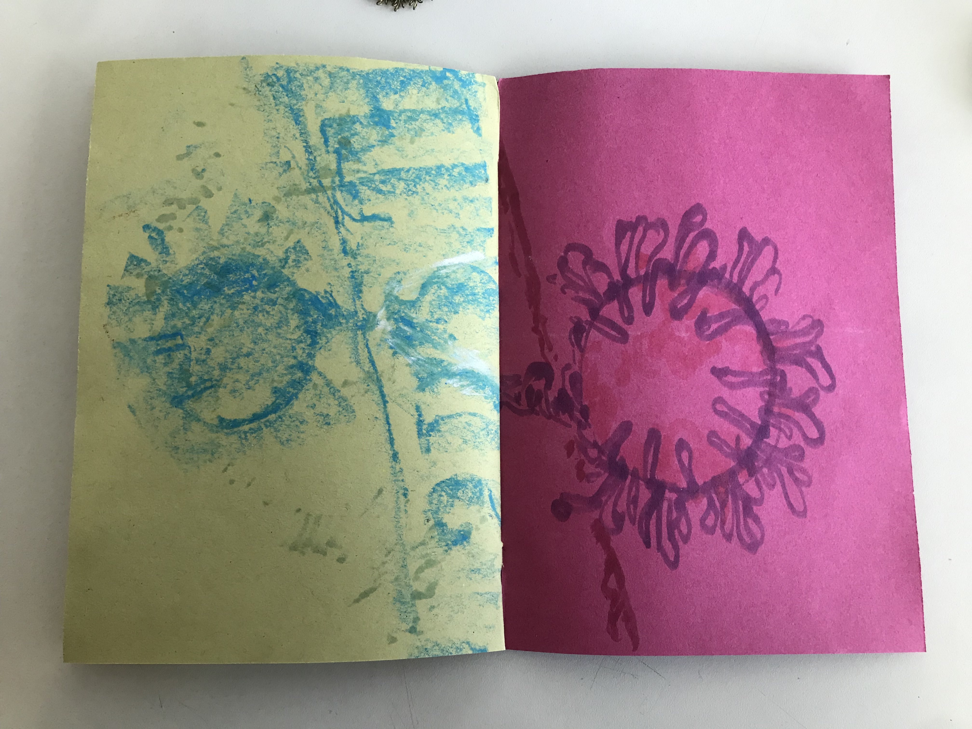

My only little germ of an idea right now, is that I've just picked up rollerskating. I've loved the idea of skating for a while, but only just bought some boots and decided to learn. I'm a super beginner skater looking for good places outside to skate, and I have, secretly, had the idea of making a comic about my rollerskating journey for a while... so why not fold that into it?
Wednesday 17th of April [written 17th april]My CTS project, totally coincidentally, is about a graphic novel about ice skating. Honest to god I did not plan that. However, it does mean I've been researching comic techniques in general (I reread and took notes on Understanding Comics), and analysing Tillie Walden's graphic novel Spinning. I'm planning to read 99 Ways To Tell A Story, which is a graphic novel exploring the same micronarrative in many different styles, for both projects.
As for Spinning: Spinning is an autobiographical graphic novel about Walden's childhood as a competitive figure skater, that puts a lot of effort into creating the atmosphere of an ice rink as something intimidating, timeless and beautiful. Walden also illustrates ice skating as a stressful combination of precision moves, drawing with elaborate motion lines and 'maps' of the skater's position. I'm inspired by Walden's skill of using absence to make the skating in Spinning feel powerful - when Walden skates, the background often falls away, creating a feeling of tight focus.
I think I feel more positively than Walden does about my skating, though it's definitely been a rocky journey as I learn and fall over a lot. I'd like to try and create something about my rollerblading journey that's as atmospheric as Walden's, something that illustrates how skating feels for me.
My plans for Thursday:
Go to Regents park, (the south london destinations in the reader sound fun, but I live north and none of them particularly pique my interest), and spend some time documenting the place in accordance with the tasks in the booklet, as well as documenting my skate equipment. If I see any other skaters, I'll ask if I can draw them, but I don't know if I will. Then: go skate! After skating, I'll try and illustrate, as Walden does, the sensory, aesthetic experience of skating, and how I feel when I skate.
Also today, I read the accompanied reader, and did some research from the reading list.
From the reader: I enjoyed the texts 'Poverty, Poetry and Dreams' by Ana Miranda and 'Being Alive' by Tim Ingold. In the first text I mentioned, I was interested by the idea of an independant, unconstrained form of 'publishing' as an expression of popular, marginalised art, a way to share not just information byt stories, hopes and joy. In the latter, Ingold's writing about Yolngo artwork, and a series of artworks representing a journey, that the readers take their own journey through, thus bringing the journey into the present. That inspires me a lot when I think about comics, a medium that one takes a spatial journey through. A comic about a journey that the reader journeys through could definitely connect to my ideas.
I also read Isabel Duarte's article in Futuress about Maria Lamas's career as editor of a fashion magazine, which was linked in the project brief. I was interested by how the form of the magazine on its own became revolutionary, by exploring new layouts and formats, it imparted feminist revolutionary ideas in its design as much as its text. I linked it back to The Medium Is the Message, where the medioum is layout and composition, that encourages people to read and think outside of the box. Really good article & I'll definitely be thinking about it in my piece creation.
I also put in a request for the LCC Zine Archives for anything about rollerskating, roller derby, wider skate culture, or sports communities, as well as zines with unusual or interesting formats, shapes or techniques. I'm kind of enticed with the idea of doing a non-rectangular book, but I don't know what I'd do with that right now, and I need to do more research. I have a friend who works at 56a infoshop, and I also asked him if he'd seen anything with a similar subject matter, and he'll get back to me later.
Thursday 18th April [written 19th april]I took the bus to Regent's Park with all of my skate gear and drawing tools. I sat down on a bench and spent some time drawing the scenery around me and my skate gear.
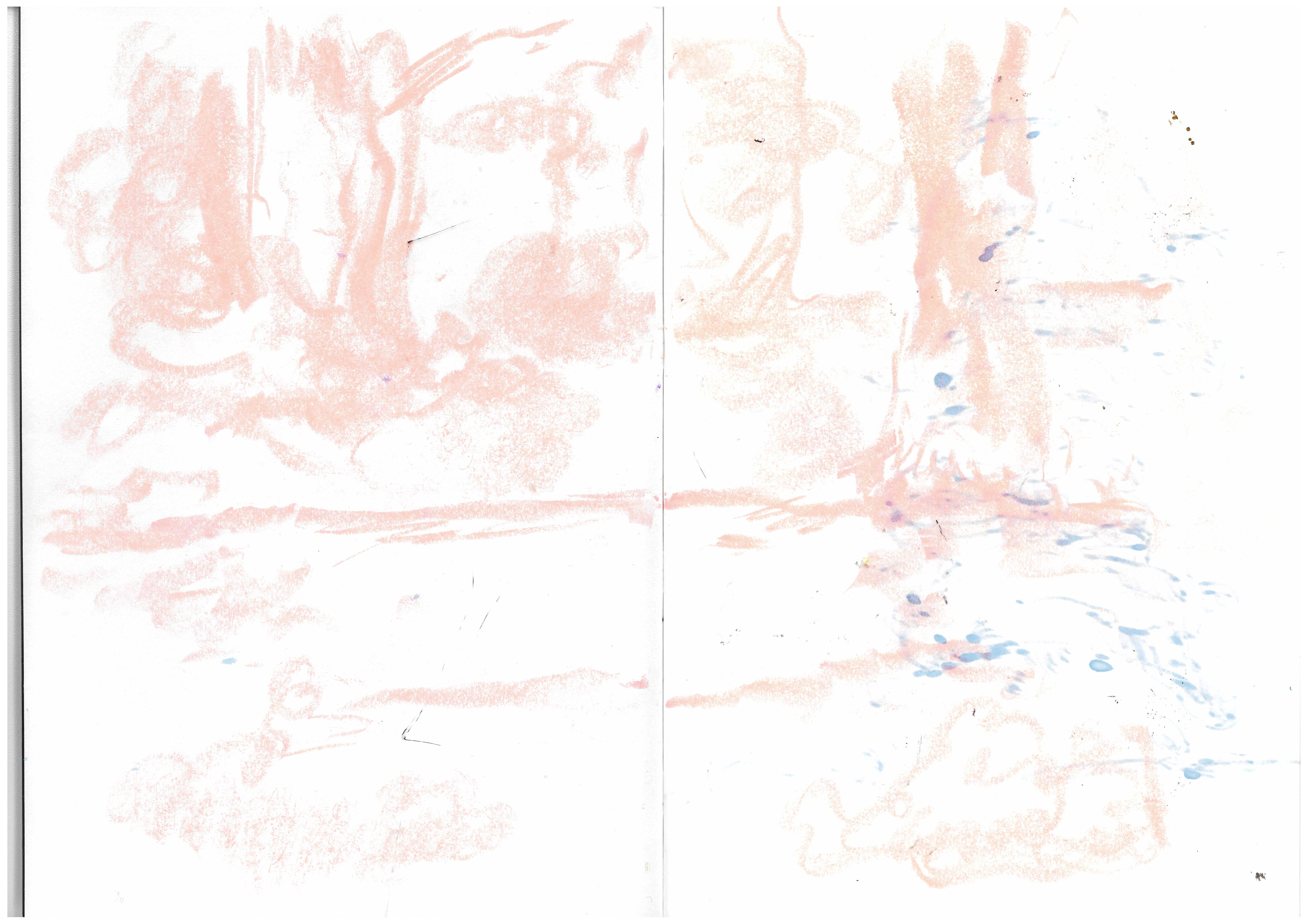

After that, I skated around for a while, and then sat back down to draw - trying to visualise the sensory, aesthetic experience of rollerskating. It's all from my point of view, so lots of drawings of my own boots, and all the bigger pose stuff is imagined. I am aware this wasn't really what the brief was, but from the feedback I would get on Friday, it seemed to still really resonate with people.
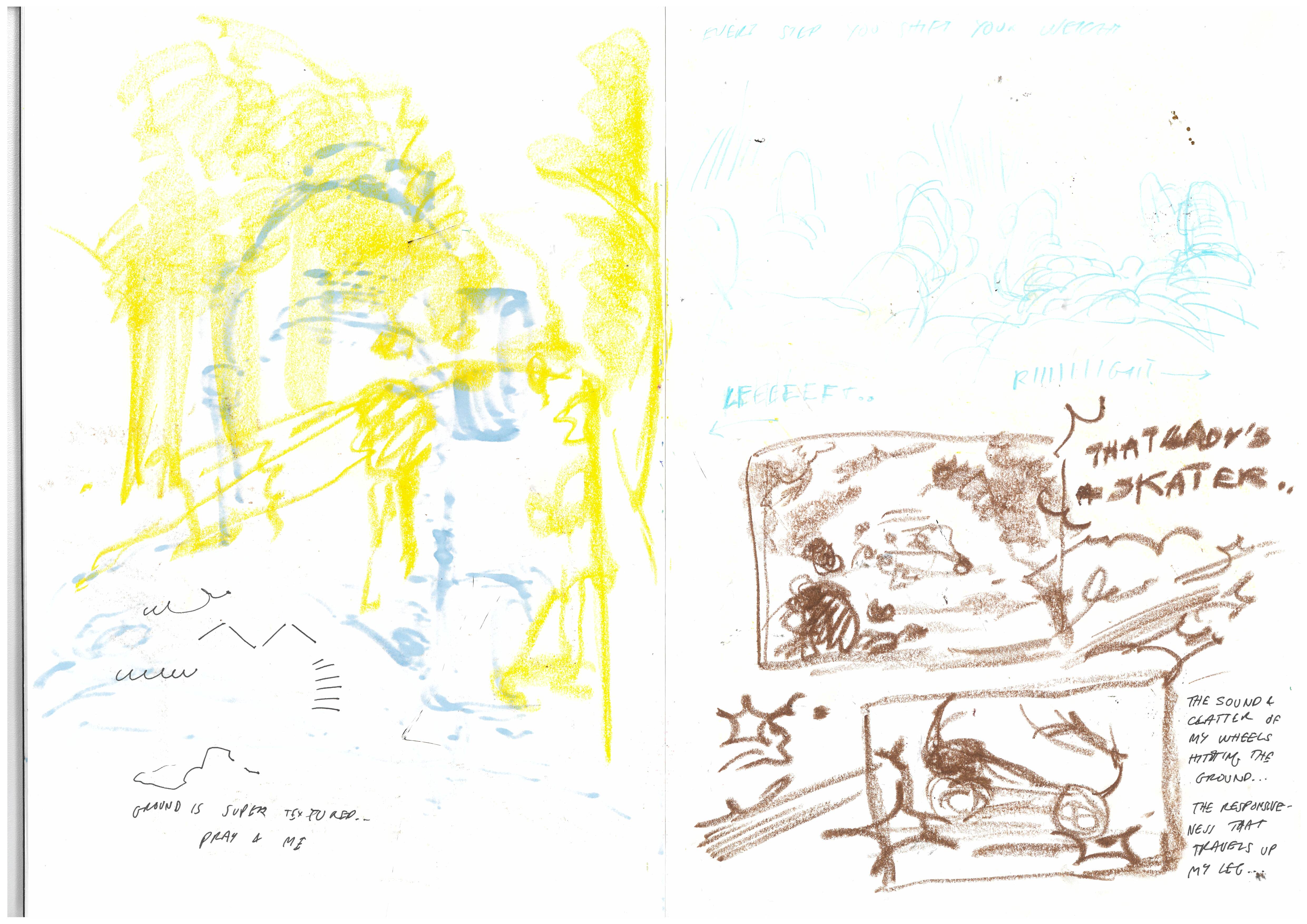
Yellow is drawings of my view when skating. On the right side, I did some sketches of what I see when I look down while I skate, the foot movement is really simple and satisfying to me. Below, I drew some more views, and how people (especially kids) will be interested or excited by seeing someone rollerskate - and started trying to visualise what I feel in my body when I skate.
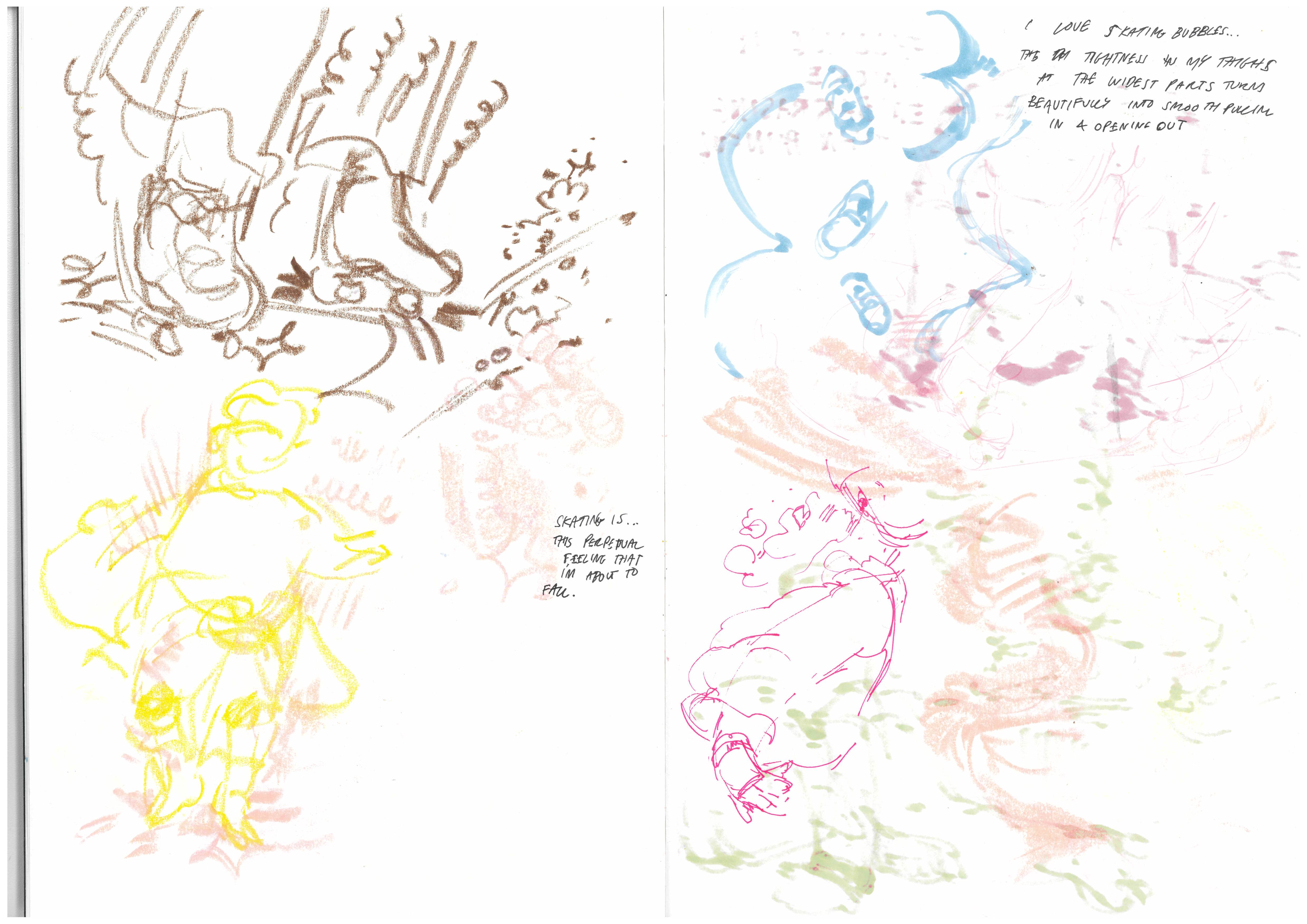
I really like that top drawing in brown. I was trying to visualise how the feeling of the rough ground travels up my legs when I skate, and the feeling of pushing off and then contacting the ground again, the really great sound it makes, and the exciting satisfying flow of movement. I tried to doodle my whole body, but it didn't really work. Right side, I sometimes skate bubbles, which is this way of moving where you're pushing back out on both sides and back in. It's really satisfying, the flow, the tension in my thighs sort of resolving as i come back together, then pushing out... I tried to draw the path of my feet.

Left side - I fell over a couple times, I'm used to it. Right side - using chalk pastels to try and recreate the movements of my skates when I skate, as well as the texture of the ground. Now i look at this, I probably should have tried taking rubbings.
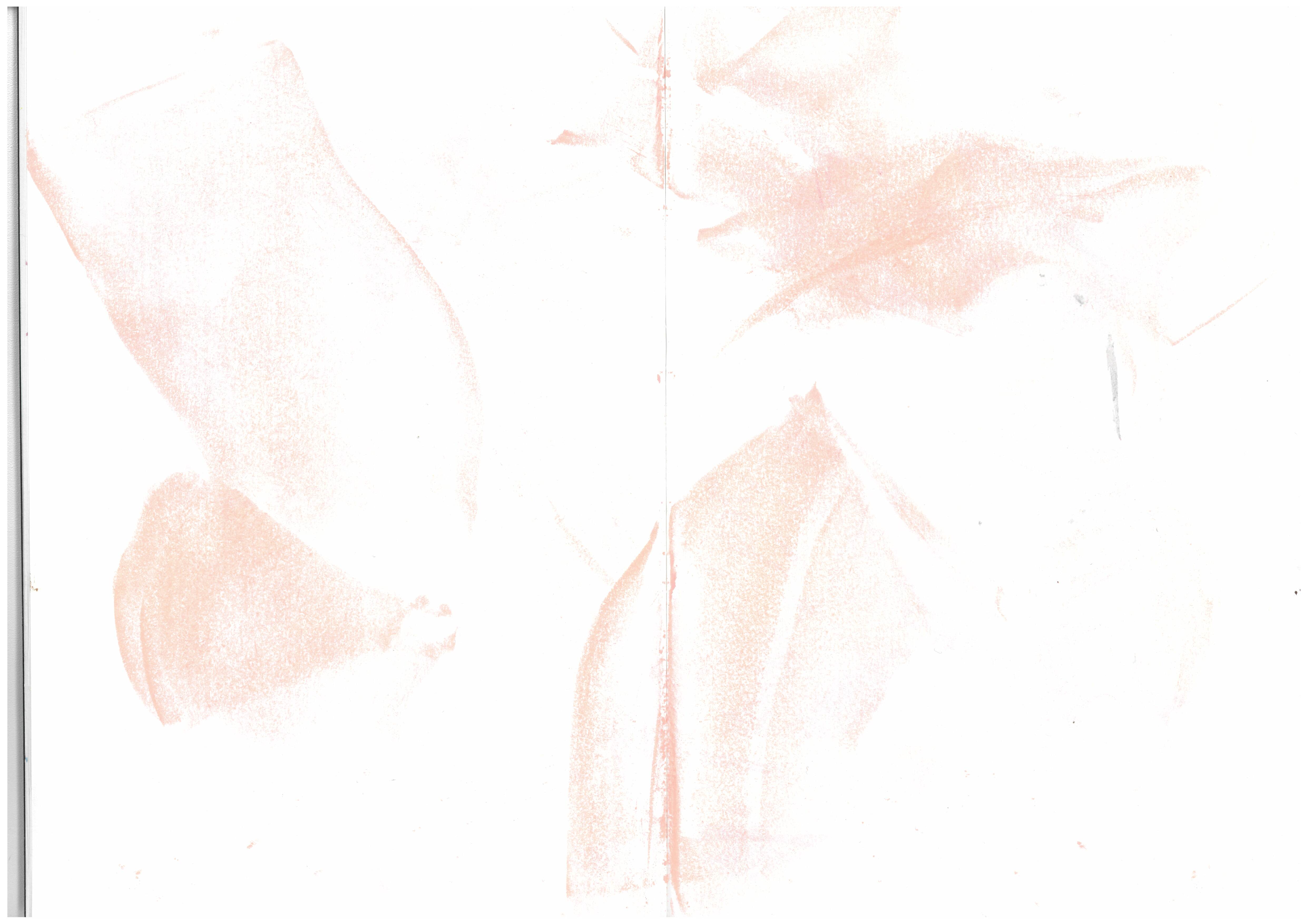
Continuing to trace my movements with pastels. I really like chalk pastels, and the oil pastels I used previously, and I'd like to carry those through into my work.
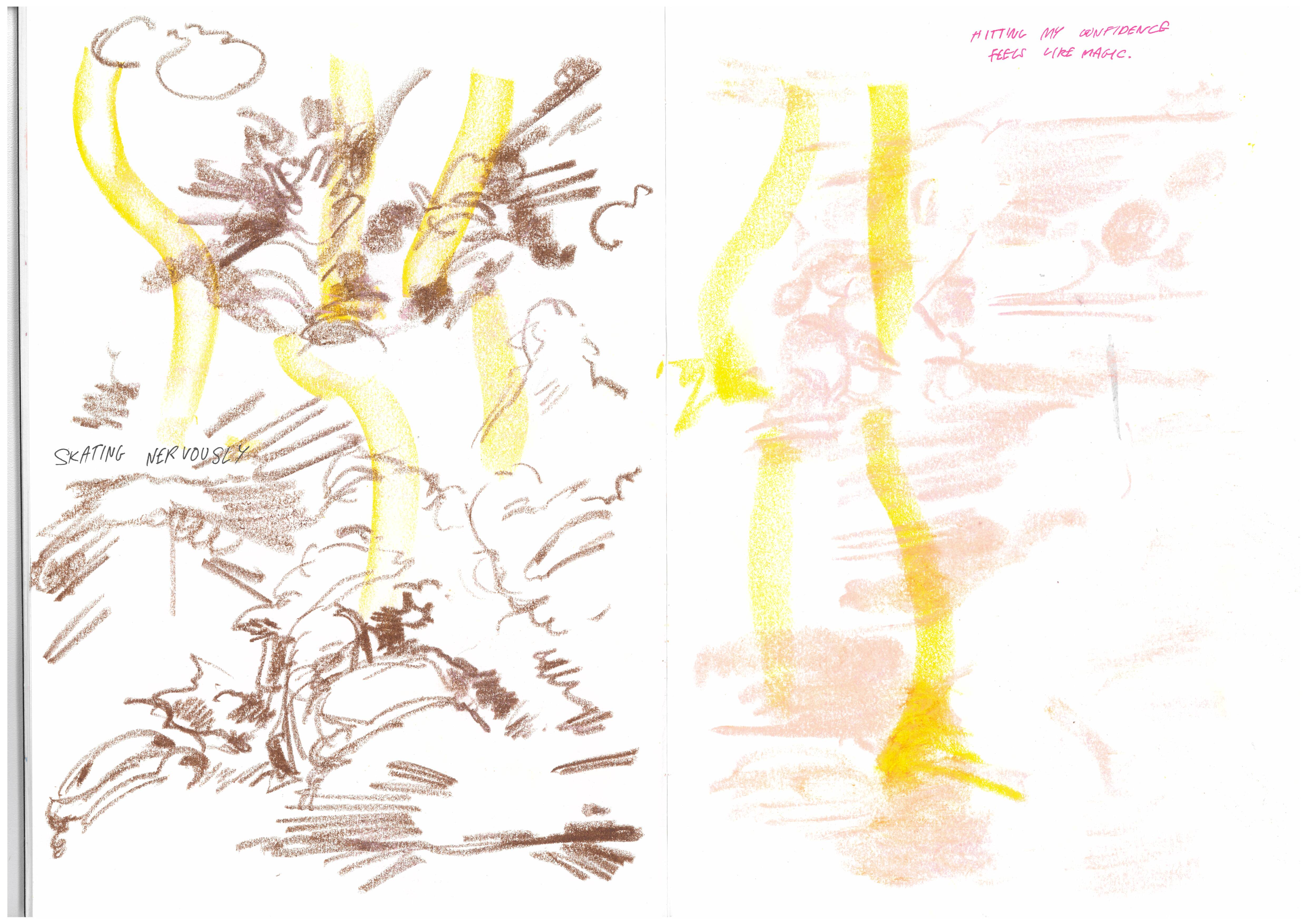
Returning to the assignment and trying to capture my experience of skating with drawings influenced by emotions. I'm really happy with these.
Friday 19th AprilTutorial! Both Rourke (student) and my tutor Eleni liked the way my drawings invoked feelings & senses. Eleni pointed out that the more abstract work I did is great because it makes sense in context. Eleni suggested returning to the initial exercises again and practising drawing with various emotions. She also suggested thinking about different perspectives and compositions to emphasize the feelings I'm portraying, and perhaps experimenting with more diverging styles from my own.
I've been feeling pretty good about my drawings - I agree they're a different approach to the brief, but they seem to be effective. I am also really enjoying the chalk and oil pastel textures I've been using, and I expect I'll keep using them. I think I'd like to draw my actual comic digitally, for reasons of ease, but adding chalk/oil pastel traditionally would be cool. If I'm risoprinting it, I could add chalk pastel in another colour layer, which would then be easy for me to draw on top of my printed out drawings with tracing paper, and then scan that in. I'll ask about that in the risograph department.
I also looked at the publications in the centre of the studio - although I didn't do the analysis task (I will do it, on the comics I get out from the zine library) Here's one I really liked, Robert Hunter's The New Ghost. I loved the colour scheme and the panelling choices.
Digital skiiiiills! Here's the scan I was working with:

and here's the edited version:

It's pretty subtle, but it's closer to life, and the middle page crease, and multiple bits of scanner dirt have been fixed, mostly with the help of Clone Stamp tool or Spot Healing Brush. The colour adjustments were done with lowering the contrast, and using Selective Colour to make the pink chalk, which scanned in as orange, more pink.
Sadly, I wasn't able to change the colours of images on InDesign - no clue why, but it was a problem some classmates also had. It's a shame, because the Colour Wash function looked really good for mocking up risographs.
Week 24
Monday 22nd AprilFilmed some very basic reference footage of me skating back and forth to help me with this comic project. On Monday morning, I decided to use it to revisit some of the tasks from the initial briefing exercise. I started off drawing a simple drawing of myself skating in black brush pen, thinking about drawing myself with passion and enthusiasm, then added chalk & oil pastel effects that try to convey those same feelings.
Then - just zero'ed in on my skates, and tried to draw them with increasing levels of frustration and anger. Did some fun stuff with turning the oil pastel as I drew to get this wiggly, uncontrollable line variance. I think these were super effective and I enjoyed drawing them, focusing in on tone too. After really enjoying that, I wanted to combine it with the cleaner, brush pen drawings I did that I was also really proud of. I drew in pastel, then stuck a sheet of translucent paper over the drawing, then added nervous lines in brush pen. I do think it worked well, and I think I'd like to risoprint in that effect.
 Tuesday 23rd April
Storytelling workshop! I enjoyed the image analysis exercises, and the storytelling exercises. Over the course of this studio lab, I figured out the story of my comic, its beginning / middle / end, helped by the exercises we did as a class.
Picking an image and drawing 5 minutes before and after - the image I picked was that POV shot of my rollerskates from my initial drawing session.
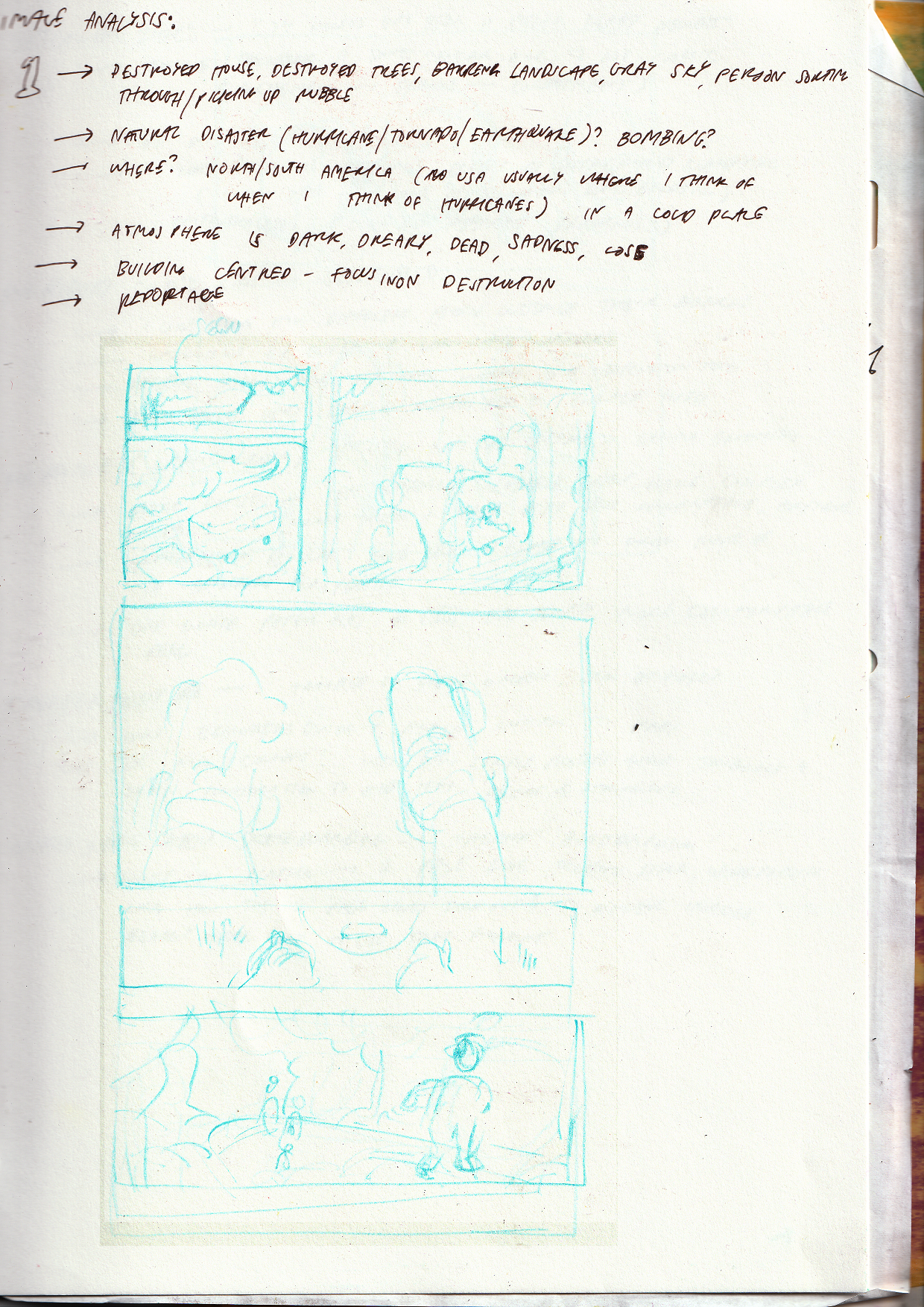
Picking an image and drawing a month before - Same image. I got into skating after having a bad mental health episode and deciding I needed an outdoor hobby.
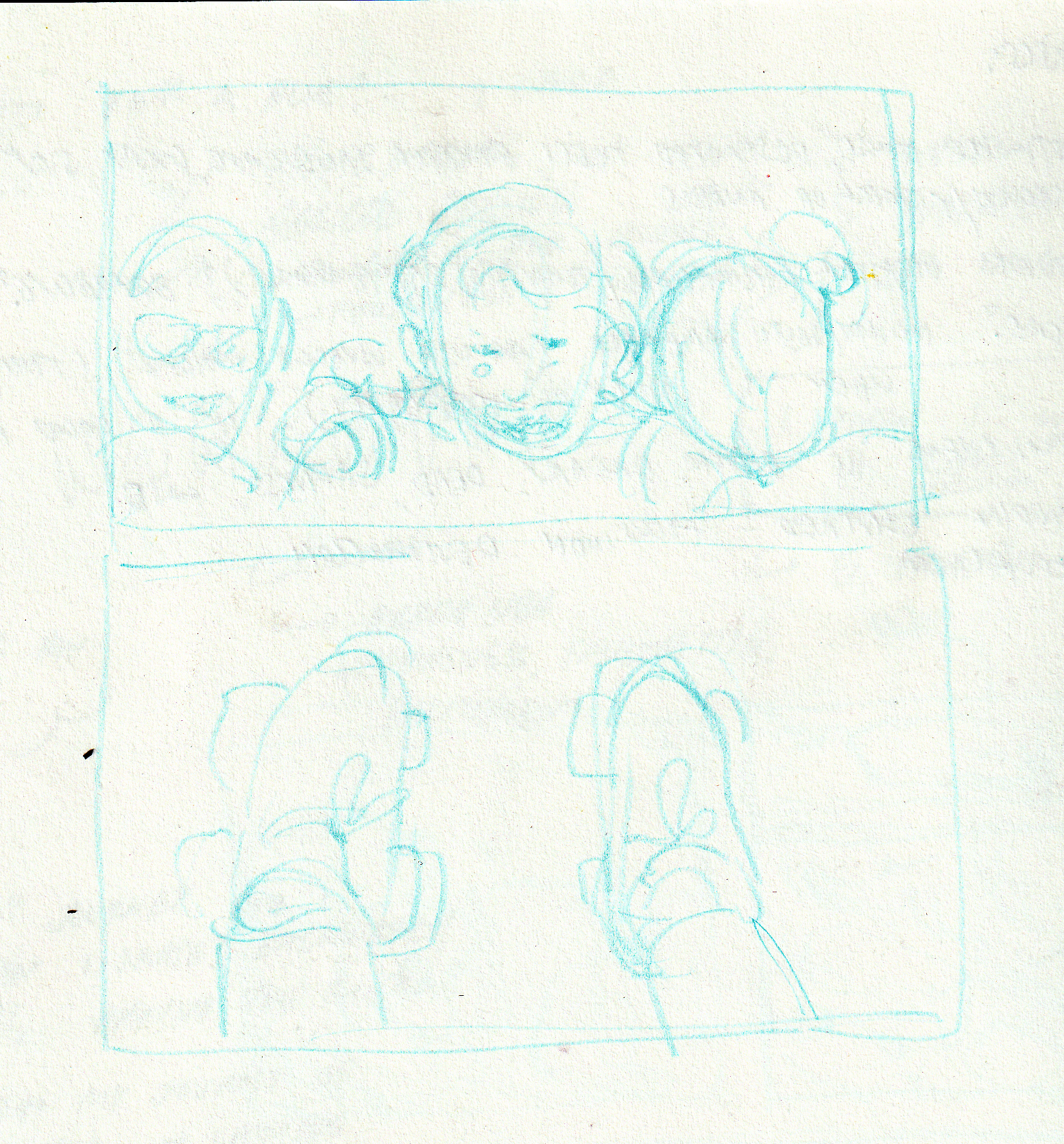
Same frame as beginning, middle and end - I enjoyed this exercise a lot - the placement of my frame really dictated the feeling of the story, I felt.

I want my narrative to have the contextual lens of passion - which can lead to both enjoyment and nerves! I wanted to put a lot of work into capturing the emotions I feel when I skate, (as my favourite thing about illustration is its power to convey emotions), using comic panelling and textures similar to my work on paper. I'm settled on risograph printing - the colours are really vibrant and evocative, and it's a method I love using.
I was wondering if this project is pretty pedestrian (no plans for crazy binding or other off the wall stuff), but I have been wanting to do a straight-up comic for ages, so I'm happy to get the chance. I've also been doing a fair bit of comics analysis for CTS, so hopefully that can build on this.
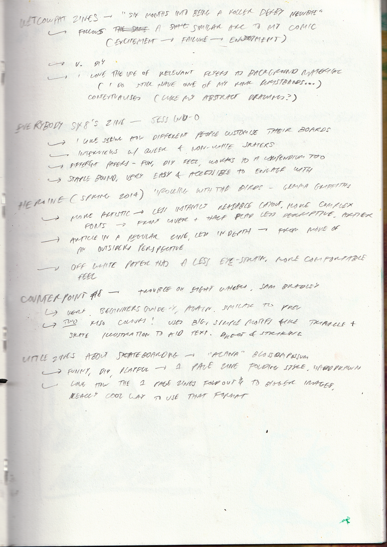
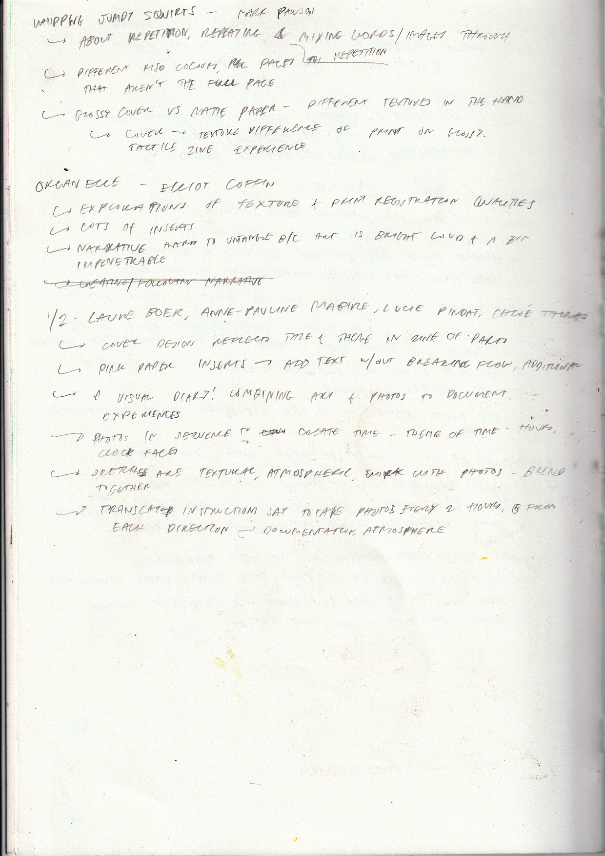
Wednesday 24th AprilI visited the LCC Zine Library, read two boxes of zines (one box about rollerskating, skating, and general sports fandom, and one box about creative layouts) for research. The full notes I made are scanned below! The rollerskating zines were either an external writer/zinemaker learning about rollerskating and explaining it to the reader (usually these were regular publications, with a more traditional publication feel,) or people's personal journeys in rollerskating or derby or skating. I think I preferred the second, they had a lot of passion and energy, and I really enjoyed reading them and seeing where our skate journeys lined up. The more DIY zines, in my opinion, did a better job of conveying their passion for skating, in being more approachable and direct and expressive.
The second box I looked at was about unusual or artistic zine formats. I really liked 1/2 by Laure Boer, Anne-Pauline Mabire, Lucie Pindat, and Chloe Thomas. It was close to my project, as it was pretty much a visual diary, and I really enjoy how the images were presented to create a narrative over time, and set against sketches - creating this feeling of a whole experience represented here. I also really enjoyed the little inserts that added text, on a different paper colour - I thought they were a good way of stylistically adding explanations, and weren't invasive. There were some other zines I looked at too, mostly interested by how they repeated or contrasted images to create a narrative or atmosphere.
During this session, I figured out the format & physicality of my production, and did thumbnail sketches for each page. I learnt how to make this really cool four-page square book that folds out from Jamie, which I'm going to keep in mind to use later down the line. I didn't really want to do a bogstandard bound book, so I thought a concertina book would be interesting - it has a strong forward direction, which fits the theme of skating, and means you can view the whole narrative at once if you like, which I found interesting. I made various mockups this session, originally trying to fit everything onto one A3, but that would make the book very small, and I wanted a larger, artistic book as opposed to a smaller, holdable one.
Eventually I settled on printing on two single-sided A3 sheets to create a 6-page (5 pages + 1 front cover) concertina book. I planned to use bookbinding tape to attach the A5 pages together, that way I wouldn't need to make the pages smaller with flaps, and the book would lie flat and be more easily constructed.
With a format & a narrative, I set to drafting the comic!
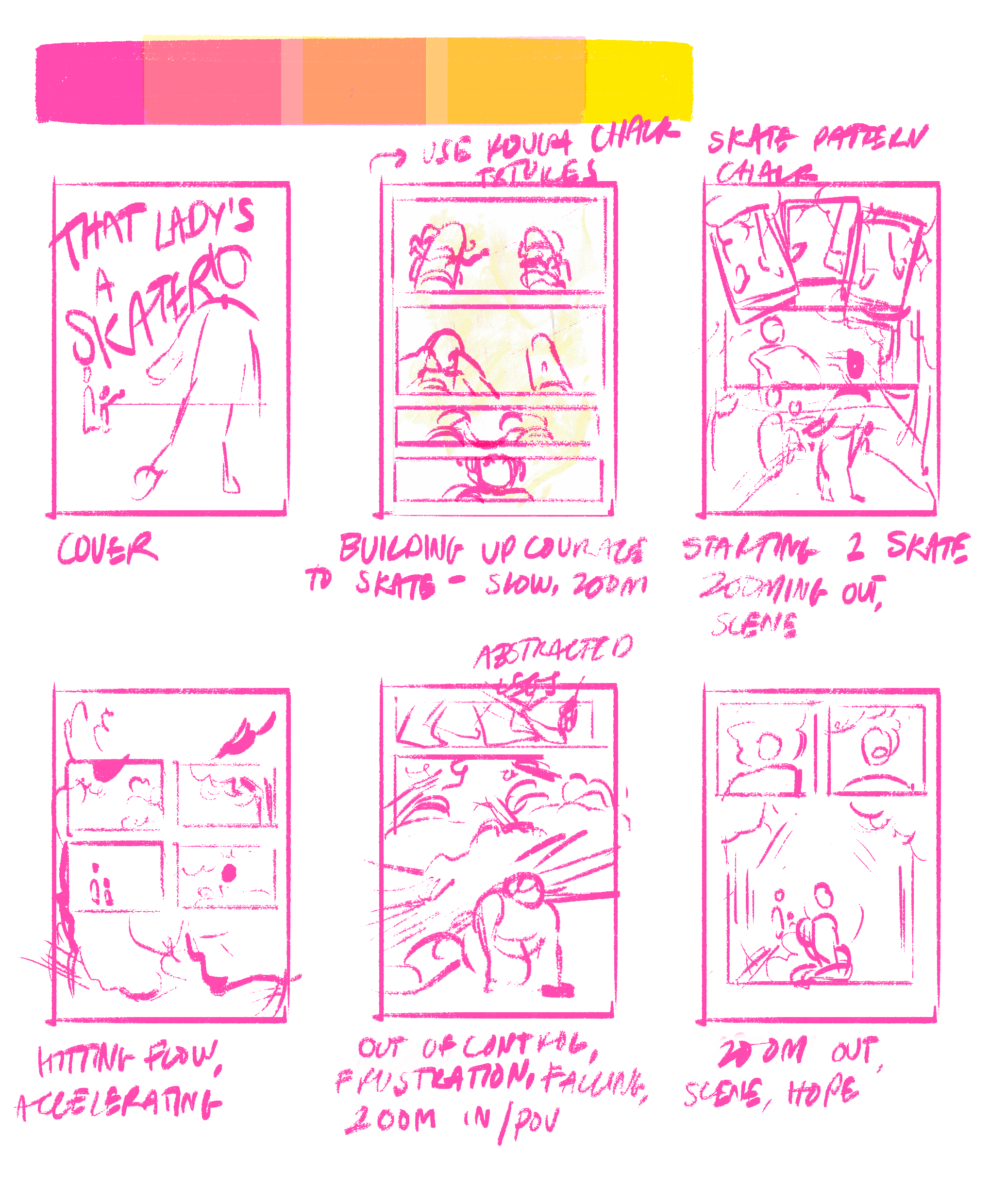
I wanted to have this journey of objectiveness vs abstract-ness - when my character gets into the flow of skating and the whole emotional experience of it, I wanted the work to become more abstract and expressive, more about feelings than what I was seeing or doing, since that seemed to really resonate with people. I settled on yellow and pink for riso colours as they're bright, airy and expressive, and I really like the range of yellows, oranges and pinks you can get when you combine them.
Monday 29th AprilWorking on comic!

Traced the drawings of my skates from my initial visual diary entry, so I didn't have to draw everything again. I like this page a lot, I wanted to start the comic off slowly, by having the panels occur across small timeframes, with little movement, then slowly building up speed and motion across the narrative.
Tuesday 30th AprilWhile the studio session was helpful for refining my story and defining my aims with my publication, it was also not that useful to me, as I'd already started on my publication in order to make something complete by the time. I want to create something artistic and fun, sharing my experience, perhaps to fellow skaters, as opposed to explaining skating to outsiders (like the zines I talked about before.)
Continuined working on the comic - I printed out the two pages I'd inked on printer paper, and then used tracing paper and an oil pastel to add texture in the right places. I wanted to both add shading and 'objective' texture/details, as well as adding more abstract & symbolic textures and elements to convey that emotional/sensory experience.
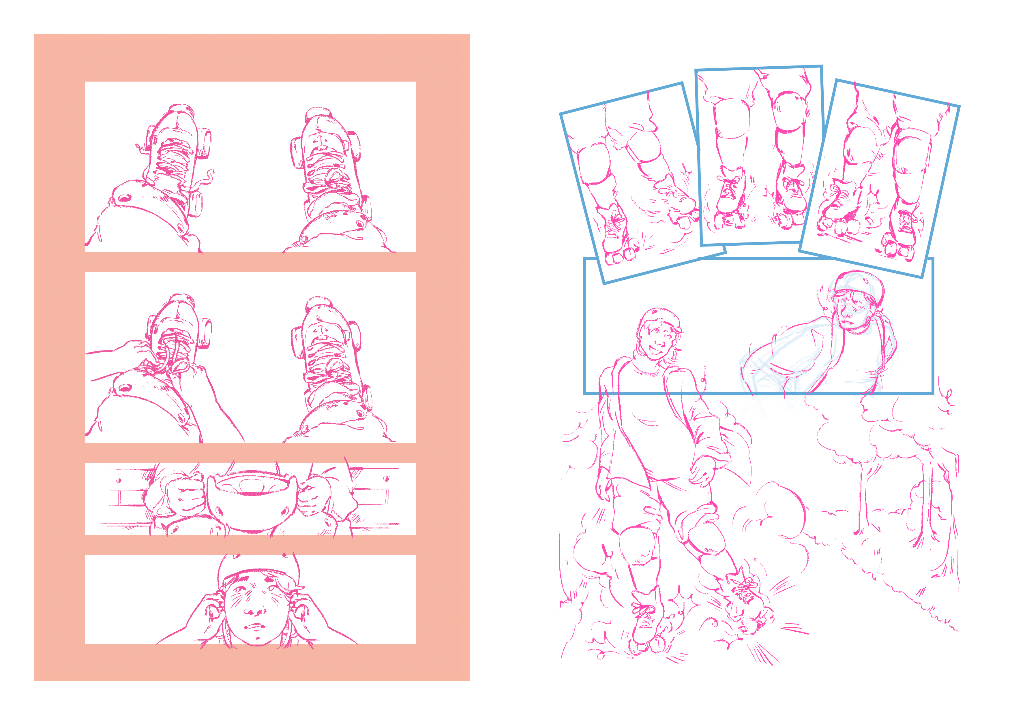 Wednesday 1st May
Scanned in & added textures to comic pages!
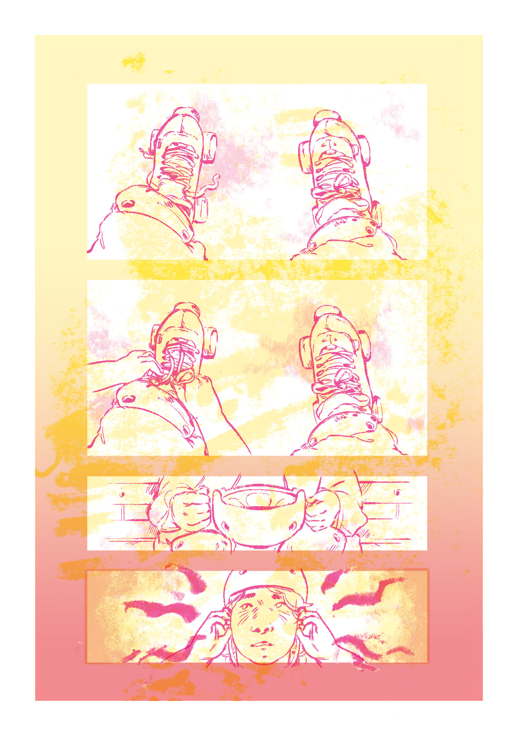
I added some minor shading, but mainly I added a stippled, rough 'ground' texture to the page, to illustrate that skating on rough ground is difficult to deal with as a beginner, and also general nerves. I also added a gradient to guide the eyes and add some more visual interest, since the background's pretty large - I think on retrospect I could've done without it, I'm worried the page gets too crowded.
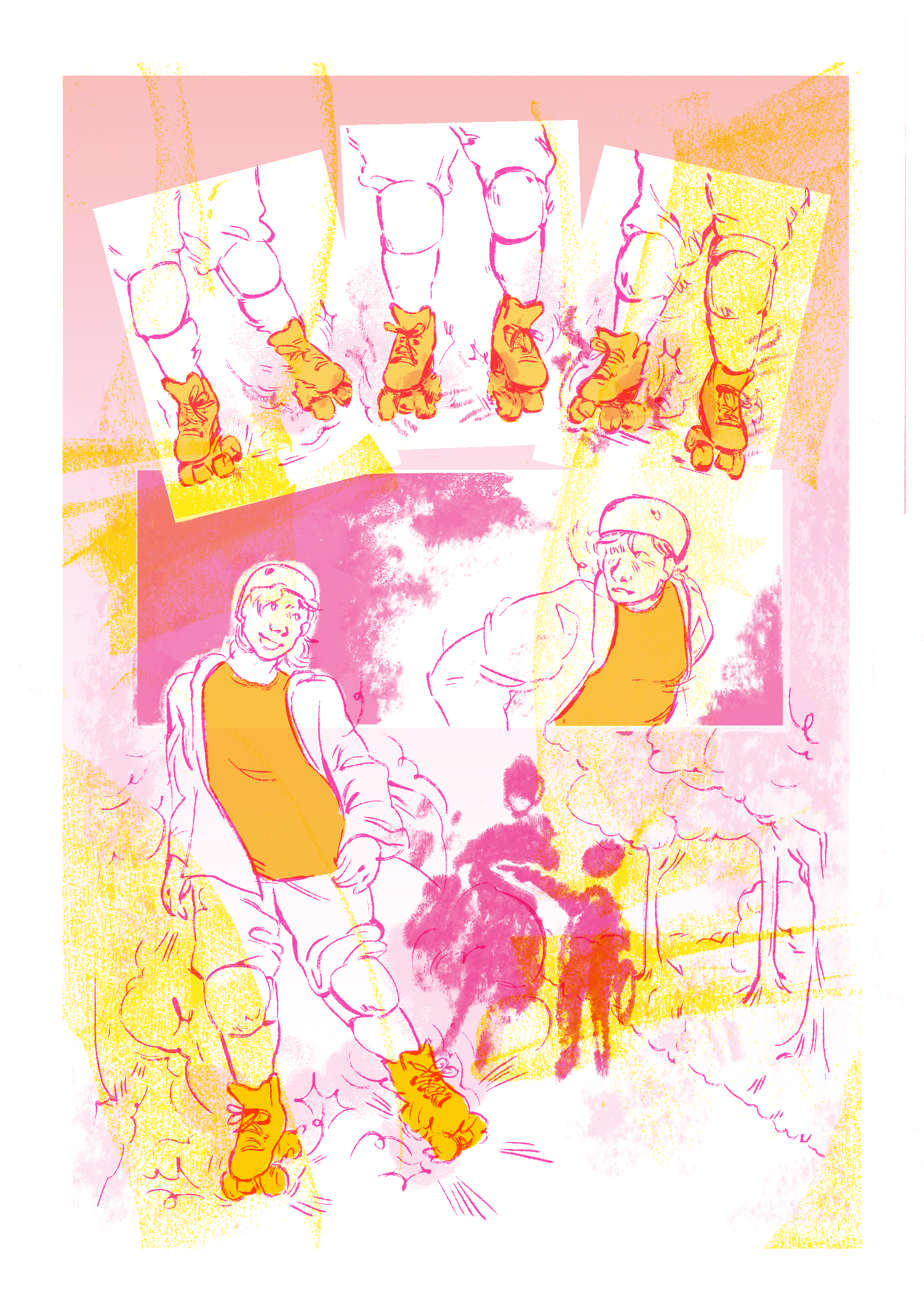
The chalk skate tracks I made in my first visual diary got a lot of compliments, and I really liked them too - brought them into this page since it's the most direct 'skating flow' one. Again, I worry it suffers from having too many elements, and I think I could have been more structured and composed about it. I do really enjoy how the pink pastel background figures and the yellow skate marks came out, I think they add a lot and create nice colour combinations.
Examples of some of the oil pastel textures I made for these pages.


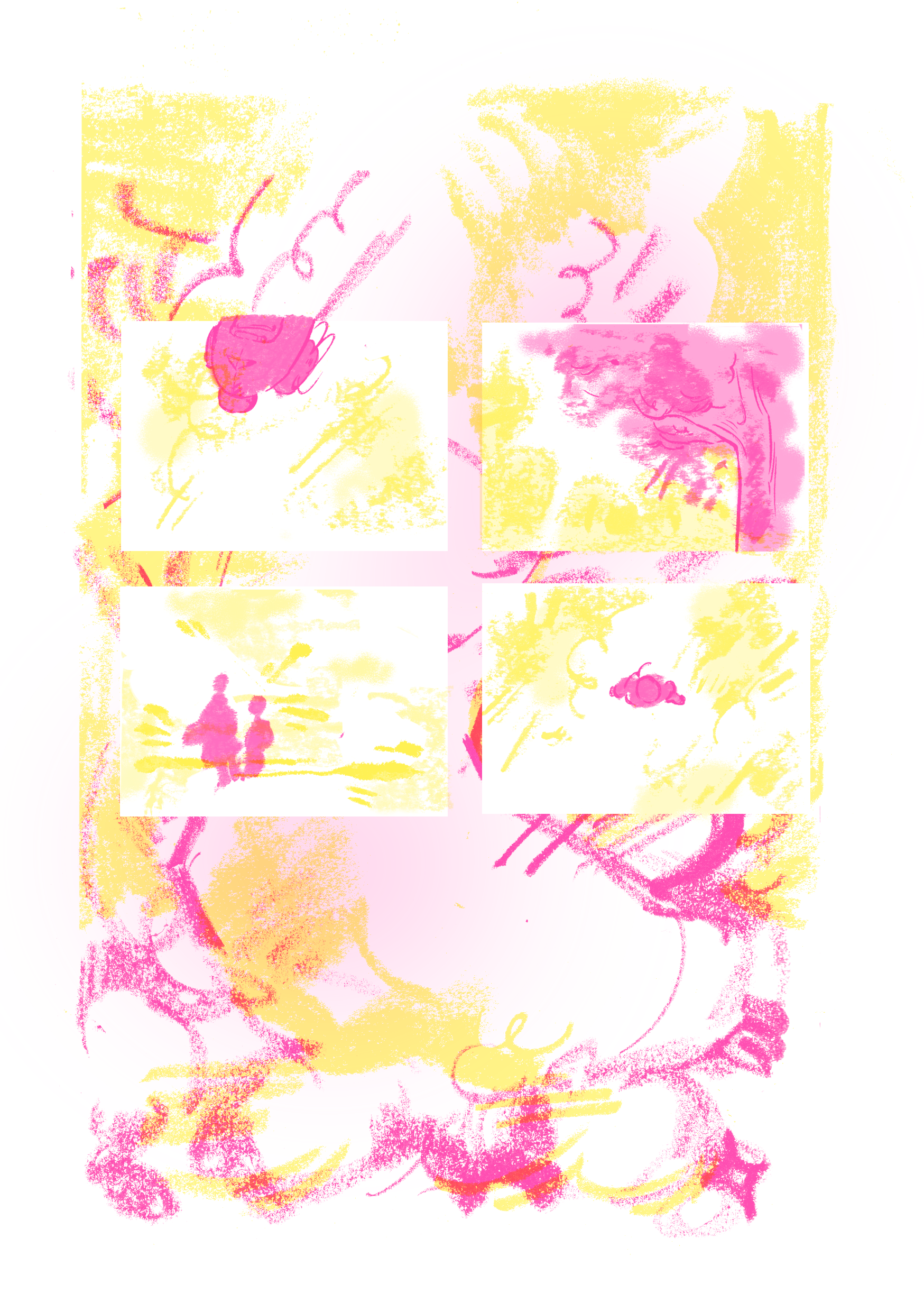
Also sketched & did oil pastel details for page 3 - the really abstract one. I wanted this one to be super feelingsy and sensory. Will put it together tomorrow. Thursday 2nd May
Scanned in panel elements for page 3, and drew background freehand with chalk, based on some sketches I'd already done, traced and added shading in another colour. I liked this illustration a lot when I did it - looking back, I think it's not as strong as some of the sketches I was referencing, and I probably could have scanned some of those, but I did like it in the moment. Debated a long time over the background elements - was going to do a fill, decided not to... I think I like how it reads.
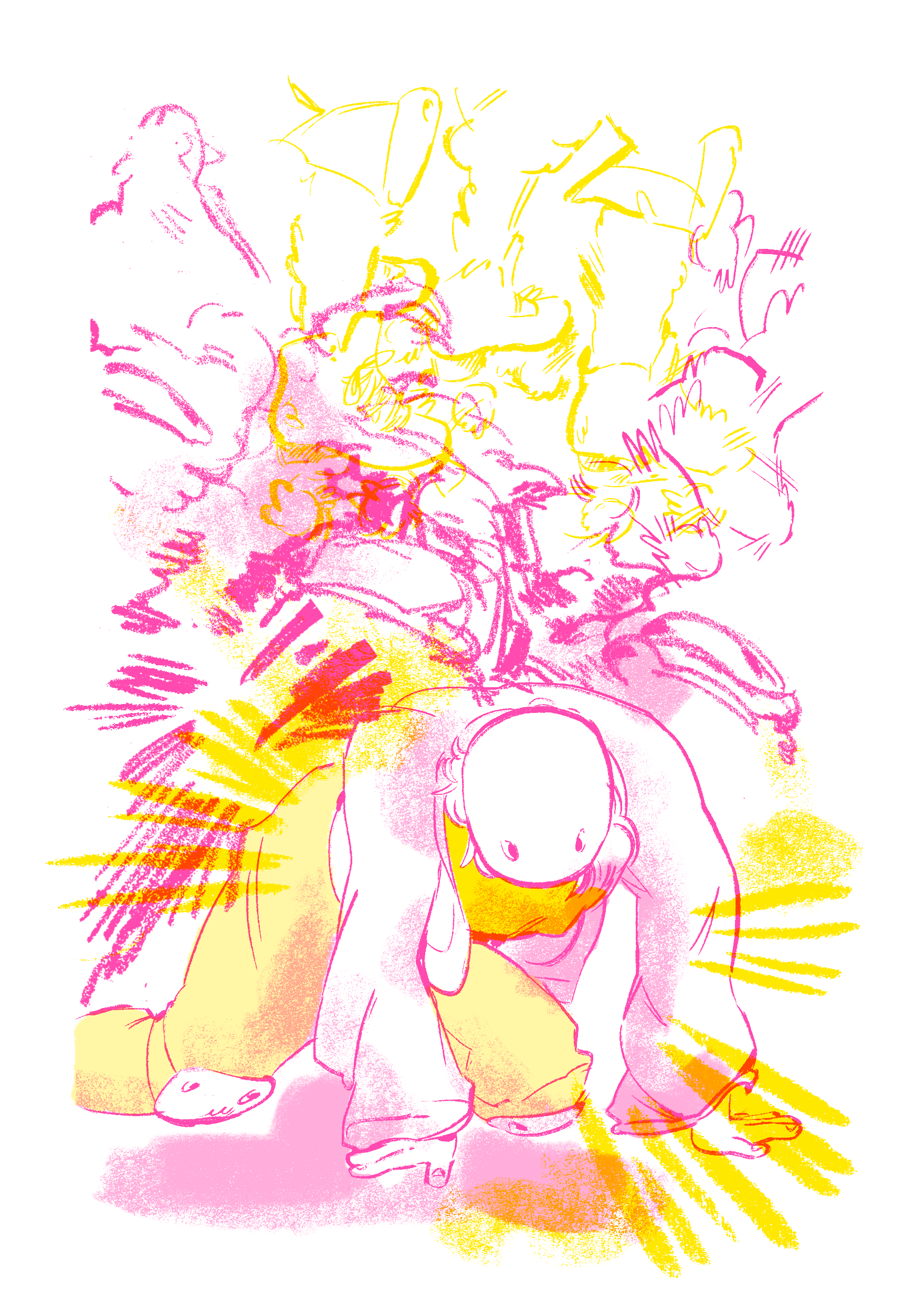
Since I was getting short on time, and I had to print on Friday morning, I just scanned some visual diary drawings in for this page & fiddled with them a bit - the drawing of my character falling over was half from scratch, half from a drawing I scanned. I am incredibly proud of this page. I think it's the most evocative one in the zine. I do think I could have lead into it better, though - kept a more concrete panel format in the leadup so the change is more impactful - I was trying to lead from a more excited, happy emotional representation to a more negative one, but I don't think the transition is as smooth as I want it to be.
Also did the lines on the last page! Wahoo. Almost done. I want this page to feel like a calm respite and a moment of relaxation and connection with the environment.
Friday 3rd MayQuickly finished off the last page in the morning. Really happy with the pastel effects in the top two panels - really feels like a 'frustration - release' moment to me, and I like that a lot. Also did the cover - it's a bit scrappy, I'd have liked to have been able to sit down properly and spend time on making it better. The title is a reference to things children (and sometimes adults) have shouted when I skate by - they get adorably excited by the presence of skaters.


Frustratingly, the risograph machine I booked was broken and nobody told me. I had to wait for hours and miss my tutorial, just in case someone else on another machine finished so I could snag the spot. When I did print, I was really happy with the outcome. However, with the two-drum machine, the colour mixing didn't come out as strong as I'd hoped. I don't know if that's just how the two-drum machine works - the yellow seemed to sometimes resist the pink instead of overlaying them, but I'd have liked to see more combining of colours. I probably could have used the colour combining better/more across the whole comic, to be fair. Also, the screentone picked up the pastel texture really well. I am incredibly happy about that.
I do just enjoy the process of risoprinting so much. I had a really wonderful time seeing my digital drawings turn into something! Also, cut everything down on the big guillotine, and got it creased in the middle, which is lifesaving.
Digital class, just continued work on printing stuff. I enjoyed the book cover discussion - I like book covers a lot. I knew a lot of the print & finishing stuff, but there were some names of paper types I didn't know, which is cool.
Monday 6th MayBound my book together in a concertina format with bookbinding spine tape. I realised I'd forgotten to sign it in the actual drawings, so I editioned, signed & stamped my little psuedo-maker's mark dinosaur stamp on the other side of the start & end pages. It's a little touch, but I think this really makes the publication feel more professional. Made 5 copies, just in case one goes wrong or I need extra.
I am really damn happy with these. Some issues, but I went into this project trying to make a comic I enjoyed, and I did! A really fun end to the year.
Tuesday 7th MayFormative daaaaay! I was sat in a circle with Ren, Sophie, Yuxuan, Jocelyn, Olivia and Shan. I didn't know most of their work, so this was great.
Some notes I had on other people's zines and cool conversations we had:
- Jocelyn and Yuxuan both did one-page zines with a page of A3. They were small and very holdable. I made mine quite big, because I wanted it to be impressive, but I think I discounted the power of a tiny zine - I really enjoyed those little ones, they were so approachable, whereas I think mine might have been a bit intimidating at such a size.
- Sophie's zine used this really interesting psuedo-co llage techniqye - piecing together a narrative through related images and references to other artworks. I thought this was super effective, it had a great effect of inserting a bit of yourself into the story as you try and untangle what it's about. The book was also hand-bound in a Japanese stab binding technique, and contained various paper colours, reflecting this assemblage style.
- Shan's zine was a Portrait a4 folded in half, to create a little book, but then unfolded into a spread - I genuinely found this super charming, it felt like discovering something.
- I really enjoyed the mix of more direct and more atmospheric storytelling - so many clever techniques!
As for feedback i got from the others, here's my sheet! (mostly written by Olivia, I added some things I noticed when they looked at it or that didn't get written down.)

People responded really well to the book, it seems - although they did tend to take a while to figure out how it was actually meant to be read. People complimented the signing & the stamp, saying it gave the book a really finished and well-presented feel. Some of the abstract stuff, namely Page 3, didn't really land. I do think it looks a bit better digitally than on print, but I agree it's not great. I was hoping that, as Eleni said a few weeks ago, establishing context means that the more abstract visuals are contexted and intelligible. I think these weren't clear enough anyway (yellow & pink on white is a rough combination for readability) and didn't have enough context and lead-in to make it make sense. The large size makes it feel very official and artistic, but perhaps less approachable.
I enjoyed seeing all of the classwork a lot and I'm really excited for the exhibition.